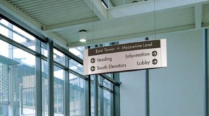
Wayfinding signage or also known as architectural signage can be some of the most helpful and yet attractive signage made. Your business name and it’s best interests for your customers and invited are best displayed in this fashion and in a multitude of styles.
Bronze…aluminum…metallic gold…stainless steel veneers to accentuate your name and or purposes along with the means of suspension…extensions…and stand-offs to punctuate a theme or system are some of the niceties that this type of signage offers and speaks to customers and those who will frequent your office…market…or complex.
 Your clients…customers…or just those in general needing to get somewhere need to be directed and when they’re directed with signage that is appealing…creative…custom…and neat—it will grab their eyes…their attention…and not just get them there but remind them of where they’ve been.
TNT SIGNS & GRAPHICS produces WAYFINDING and ARCHITECTURAL signage for our clients. It really is the kind of signage we enjoy getting engaged in because it is so clean and individual. Yes it is in some cases everywhere people venture but when you stop and think about it, this type of signage is exclusive in regards to the place or business it represents.
Professional buildings and offices…shopping centers…transportations hubs…or historical downtowns…WAYFINDING signage is a plus and can be created to suit the place and position uniquely. TNT SIGNS & GRAPHICS is at your service ready to meet your WAYFINDING and ARCHITECTURAL sign needs.
Innovative Applications for Wayfinding and Architectural Signage
Enhancing User Experience with Digital Integration
Have you thought about combining traditional wayfinding signs with digital technology? Interactive kiosks or digital displays can take architectural signage to the next level. These signs can show real-time updates, such as event schedules, room availability, or even local weather forecasts. For example, a shopping mall might pair sleek, metallic wayfinding signs with touchscreen maps to give customers a seamless navigation experience. It’s like turning your signage into a concierge service—practical, modern, and memorable.

Wayfinding for Accessibility
Wayfinding signage isn’t just about aesthetics—it’s about inclusion. Adding braille or tactile elements, high-contrast colors, and ADA-compliant features ensures that everyone, regardless of ability, can easily navigate your space. For instance, a hospital could use stainless steel signage with raised lettering and arrows to help visually impaired patients find their way. Thoughtful design shows you care, and it builds trust with your audience.
Branding Through Architectural Signage
Wayfinding signs can do more than guide—they can tell a story. By incorporating your brand’s colors, fonts, and logos, you create a cohesive experience that reinforces your identity. Picture a historic downtown area with wayfinding signs featuring ornate bronze finishes and vintage lettering, aligning with the town’s charm. Or imagine a tech campus using minimalist stainless steel signage with sleek, modern lines to match its innovative vibe. Every detail becomes an extension of your brand.
Architectural and wayfinding signage isn’t just functional; it’s an opportunity to enhance experiences, promote accessibility, and solidify your brand’s presence. Why settle for ordinary when you can create signage that truly stands out?
Exploring Architectural and Wayfinding Signage
Architectural and wayfinding signage isn’t just about guiding people; it’s a creative blend of functionality and design that can transform spaces. These signs are essential in making environments intuitive, attractive, and reflective of a brand’s identity. Let’s dive deeper into the versatility and value of these signage solutions.
The Unique Appeal of Architectural Signage
Architectural signage goes beyond typical signs—it’s an art form that enhances your space’s aesthetics while delivering clear messages. Crafted from materials like bronze, aluminum, and stainless steel, these signs exude durability and elegance. They can be customized with stand-offs, veneers, or even backlit elements to create a professional and visually appealing look.
For example, a corporate office might use brushed metallic nameplates with a sleek font to evoke professionalism, while a boutique hotel may incorporate intricate wood and metallic finishes to reflect its warmth and exclusivity. These signs don’t just guide—they leave lasting impressions that align with your business’s essence.
Wayfinding Signage: Form Meets Function
Wayfinding signage simplifies navigation, ensuring people can find their way efficiently and confidently. Whether in sprawling shopping malls, multi-level hospitals, or historical districts, these signs direct and inform in ways that are visually appealing and user-friendly.
Key features like arrows, maps, and directory boards can be tailored to the location’s unique needs. For instance, a museum could incorporate themed designs, such as maps with artistic embellishments, while a transit hub might emphasize clear, high-contrast visuals for legibility in crowded or fast-paced environments.
Blending Branding with Navigation
Architectural and wayfinding signs offer a unique opportunity to integrate branding seamlessly into functional designs. By using consistent fonts, colors, and logo placements, you can make these signs an extension of your business identity.
Imagine a luxury shopping center using gold-accented wayfinding signs that complement the high-end brands it hosts. Or consider a university campus with bold, modern signs that reflect its innovative spirit. These designs do more than guide—they reinforce brand recognition and create a cohesive customer experience.
Digital Enhancements in Wayfinding
With technology becoming a cornerstone of modern life, integrating digital features into wayfinding systems is a game-changer. Interactive screens, QR codes, and real-time updates can provide dynamic navigation options. For instance, a large convention center might feature digital kiosks that display event schedules, floor maps, and instant alerts, making navigation effortless for attendees.
This level of engagement enhances user experience while showcasing your business’s forward-thinking approach.
Sustainability in Signage
Eco-conscious materials and energy-efficient designs are becoming increasingly popular in architectural and wayfinding signage. Businesses can now opt for recycled metals, low-energy LED lighting, and water-based paints to reduce environmental impact without compromising aesthetics.
A sustainable hotel might use reclaimed wood signage with engraved details to highlight its eco-friendly ethos, creating a connection with environmentally conscious guests.
Why Architectural and Wayfinding Signage Matters
Architectural and wayfinding signage doesn’t just direct—it creates experiences, builds connections, and enhances spaces. Whether it’s guiding visitors through a bustling city center or showcasing a brand’s personality in an office lobby, the right signage can elevate your business to new heights.
Invest in signs that go beyond functionality; make them a reflection of your identity and a tool for unforgettable user experiences.


