When you’re opening your doors for the first time, there are a thousand decisions competing for your attention, logo, website, leasehold improvements, staffing, point-of-sale. But out in the real world, the very first brand experience most customers will have is not your homepage or your Instagram feed. It’s your primary exterior sign, the big, unmistakable identity that tells people who you are, what you do, and where to enter in three seconds or less.
This isn’t “nice to have.” It’s the single most important physical branding asset a new business can buy. Done right, it accelerates discovery, reduces friction, and makes your business feel established from day one. Done poorly (or installed too late), it costs you walk-by traffic, confuses deliveries, and undermines confidence before anyone steps inside.
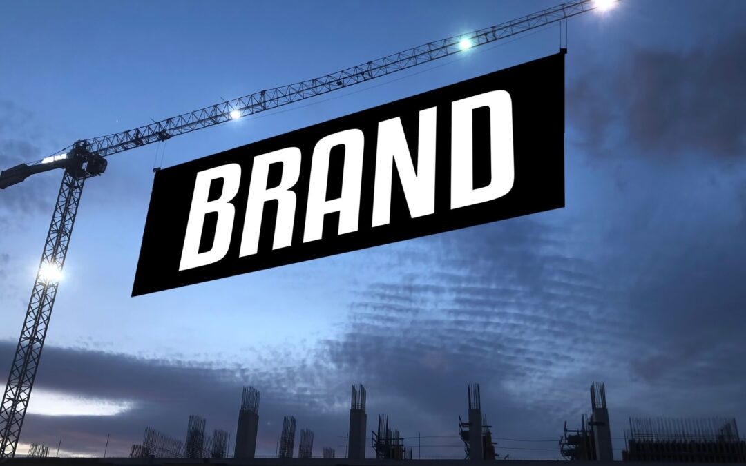
Below is a practical guide to the one sign every new business needs, what it is, why it matters, and how to get it designed, permitted, fabricated, and installed the smart way.

What we mean by “The one sign”
Every new business needs a primary exterior identity sign that passes the three-second test from the curb or the nearest traffic lane. Depending on your site, that usually means one of the following:
- Channel letters on a storefront fascia (front-lit, halo-lit, or combo).
- A cabinet lightbox or raceway-mounted sign (common in multi-tenant centers).
- A monument or post-and-panel sign for stand-alone buildings set back from the road.
- A blade sign (projecting) for pedestrian districts and interior malls.
Whatever the format, the job description is the same: be instantly legible, clearly identify your category, and guide people to the door. Everything else, window graphics, banners, interior POP, should complement this primary sign, not compete with it.
Why this sign matters more than anything else on day one
1) Discovery you don’t have to pay for again.
Your location is a media channel. A strong identity sign converts passive drive-bys into active visits, every day, for years, without recurring media spend.
2) Trust at a glance.
People judge permanence subconsciously. Professionally fabricated, illuminated signage signals stability and credibility in a way temporary posters never will.
3) Wayfinding that actually works.
Even when customers found you online, they still need to find you offline. A clear sign reduces missed turns, delivery headaches, and awkward “Is this the place?” moments.
4) Night and weather performance.
Short winter days and rainy evenings are when weak signage disappears. A properly illuminated and contrasted identity sign protects you in the “off hours” when extra impressions are available.
Design principles: The three-second rule
A primary identity sign isn’t a brochure; it’s a beacon. Follow these field-tested rules:
Letter height vs. distance
Plan roughly 1 inch of letter height for every 10 feet of viewing distance.
- Small parking lots and sidewalks: 3–4″ letters.
- Across multilane streets or large setbacks: 8–12″+ letters.
Contrast is king
Use light on dark or dark on light. Navy/white, black/yellow, charcoal/white all outperform trendy, low-contrast palettes. Avoid placing type over busy photos or wood grain backgrounds.
Say what you are
New brands shouldn’t assume recognition. Pair the brand name with a short category descriptor (e.g., “Blue Finch COFFEE”, “Oak & Iron BARBERS”). That one word drives more impulse visits than clever taglines ever will.
Whitespace sells
Crammed signs read as noise. Give letterforms breathing room. Let the sign announce, not apologize.

Illumination: Be seen after 5:00 PM
For most storefronts, LED illumination is the modern standard: efficient, long-lasting, and crisp.
- Front-lit channel letters: Bright and bold; ideal for visibility from distance.
- Halo-lit (reverse) letters: Elegant glow, great for premium brands or darker walls.
- Combo: Front + halo for maximum presence.
- Cabinet lightboxes: Even face illumination; good for complex logos or multi-tenant co-brand panels.
Color temperature matters:
- 3,000–3,500K (warm white) feels cozy (restaurants, hospitality).
- 4,000–5,000K (neutral to cool) reads crisp and clinical (clinics, tech, retail).
Use photocells or timers for set-and-forget operation and consider dimming where local codes or neighbors require it.
Materials that last (and look right)
- Aluminum: Lightweight, rust-proof, perfect for cabinets and letter returns.
- Acrylic: Smooth, bright faces for channel letters and push-through lettering.
- Polycarbonate: Excellent impact resistance for large faces or windy sites.
- ACM/Dibond: Aluminum composite for post-and-panel faces—rigid, dimensionally stable.
- Premium vinyl films: Consistent color, UV stability; choose cast films for complex shapes.
Finish choice affects legibility: Gloss pops in daylight but can glare at night; satin is often the best readability compromise.
Placement: Sightlines, speed, and setbacks
The best sign in the world fails if it’s invisible from where your audience actually travels.
- Sightlines: Stand where drivers or pedestrians approach. Are you blocked by trees, awnings, or parked vans? Raise or project the sign as needed.
- Speed: The faster the approach, the larger and simpler your typography must be. For 35–45 mph corridors, maximize letter height and contrast.
- Setbacks: If your building is far off the street, a monument or post-and-panel at the property line may outperform fascia letters alone.
- Angle to flow: Tilt projecting signs perpendicular to foot traffic; orient monument faces toward the dominant traffic direction.
Code, landlord, and permits (without the headache)
Most municipalities and landlords have rules on size, projection, lighting, and placement. Common constraints include:
- Percent of frontage: Maximum sign area tied to the width of your storefront.
- Illumination restrictions: Brightness and color temperature limits, sometimes curfew hours.
- Projection & clearance: How far a blade sign can extend and the minimum height above sidewalks.
- Monument height and setback: How tall and how close to the right-of-way your sign can be.
A seasoned sign partner prepares permit drawings, navigates design review boards, and speaks landlord language (they’ll know the “sign criteria” attached to your lease). This front-end homework prevents long delays and costly redesigns.
Opening timeline: Temporary to permanent (Without looking temporary)
New businesses often wait on fabrication or permits. Don’t go dark while you wait—stage your presence:
- “Coming Soon” windows: Frosted vinyl or bold temporary graphics that tease your category and opening month.
- Pre-opening banner: A clean, high-contrast banner with brand + category + “Opening [Month].” Use proper hardware, no wrinkled tarps or duct tape.
- Permanent sign install: Coordinate with inspections and utility availability for illumination.
- Final window/door kit: Hours, address numerals, entry arrow, policy icons (cards accepted, service animals, etc.). Clean, consistent, readable.
The goal is a continuous story: people see progress, anticipate your opening, and recognize you the day the permanent sign lights up.
ADA and practical door Details You Shouldn’t Skip
- Address numerals: Required in many jurisdictions for emergency services; spec large, high-contrast digits visible from the street.
- Hours and contact: Clear, consistent typography; don’t make customers squint.
- Accessibility: ADA-compliant room IDs, restroom signage, and tactile/raised characters where required.
- Wayfinding nudge: If your entry isn’t obvious, a small “Entrance →” panel at pedestrian eye level saves staff time and customer frustration.
These smaller elements don’t replace your main sign, but they complete the experience and reduce friction on day one.
Budget & ROI: Think total cost of ownership
Costs vary by size, materials, illumination, and site conditions, but the right mental model is TCO (total cost of ownership), not just the line item today.
- LED vs. outdated lighting: LEDs cost more up front than old fluorescent or neon, but they use less energy and last longer.
- Durable materials save you mid-life face replacements and service calls.
- Design that reads grows revenue; a beautiful but illegible sign is the expensive option, even if it was cheaper to build.
A primary identity sign works every hour your building is visible. Spread the investment over five to ten years and compare it to media you buy monthly, you’ll see why high-quality signage is one of the best returns a new business can make.
Common mistakes (and easy fixes)
Mistake: Tiny letters that look classy up close, invisible at distance.
Fix: Use the letter-height rule and test a full-size print of your main word on the storefront.
Mistake: Trendy low-contrast colorways.
Fix: Put core copy in the highest contrast pair within your brand palette. Accent elsewhere.
Mistake: Clutter, taglines, paragraphs, and promo prices on the main sign.
Fix: Identity signs identify. Put offers on changeable window graphics or interior POP.
Mistake: Approving proofs indoors only.
Fix: Evaluate mockups outside at noon and at dusk. Night performance is a different world.
Mistake: Waiting too late to start permits.
Fix: Engage your sign partner early. Landlords and cities move on their own clocks.
A quick checklist for new owners
- Define your primary sign format (channel letters, cabinet, monument, blade) based on site realities.
- Size letters using the 1″ per 10′ rule; choose a clean, bold typeface.
- Lock a high-contrast color pairing for core words.
- Add a one-word category descriptor (Coffee, Dental, Auto Repair).
- Confirm sightlines from dominant approach lanes; adjust placement or type size.
- Choose illumination (front-lit, halo, combo; color temperature).
- Start permit drawings and landlord approvals early.
- Plan a temporary → permanent signage timeline.
- Finish with door kit (hours, address numerals, entry cues, ADA as needed).
- Schedule maintenance: Seasonal wipe-downs, lens checks, and light module service.
Why partner with a one-stop shop
A high-performing identity sign lives at the intersection of brand, code, materials, and installation. A full-service partner handles the entire arc, site survey, photorealistic mockups, permitting, fabrication, and professional installation, and then stands behind the work with service and maintenance. You get speed, consistency, and a single team accountable for your first impression.
If you’re opening a new shop in the North Bay, or refreshing a location, you already have a lot on your plate. Let experienced pros sweat the details that make your sign stand out today and still look great five winters from now.

Ready to put your name in lights?
Bring your storefront photo, brand files, and target opening date. We’ll recommend the right format (channel letters, cabinet, monument, or blade), size it for your sightlines, spec materials and illumination for long life, and guide you through permits. We can also stage a clean “Coming Soon” package so your neighbors know you’re on the way while your permanent sign is in fabrication.
TNT Signs and Graphics
📍 1042 Hopper Avenue 3-F, Santa Rosa, CA 95403
📞 (707) 528-8523
🌐 www.signservant.com
Your sign is more than a nameplate, it’s your first handshake with the community. Make it strong, simple, and impossible to miss.