Signage has evolved over the years, and it’s important for business owners to keep up with this evolution. As styles change, older signs won’t get as much attention or will send the signal that your company is behind the times. This can be a turnoff to some customers, especially if you’re in an industry that changes quickly. For example, a business that deals with technology can’t appear to be outdated. Customers may assume you’re not offering up-to-date products or services, even if you are.
So what are the current custom business sign trends for 2023? Here are a few design and style choices that are currently very popular. If your signage is outdated or you’re in the process of creating new signs, keep these styles in mind.
Bold Fonts
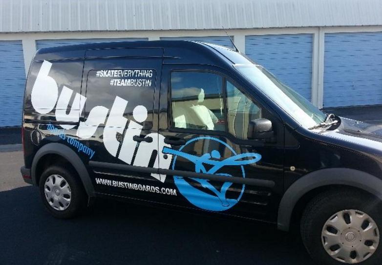
One of the current trends in fonts is to go big and go bold. The font you use says a lot about your business, and using a bold font that stands out will grab people’s attention. These fonts also tend to be very easy to read, so there’s no issue with potential customers misreading something on your sign. Using large fonts, especially on signs, is also important. You want your custom signs to be readable from a distance, especially signs on the exterior of your building or that are being used in marketing. Fonts that are too small can easily get lost among graphics and logos. Big, bold text will stand out.
Using Geometric Shapes
Another current trend in graphic design is the use of geometric shapes. Combining circles with squares, triangles, and other shapes can create an interesting design that you can enhance with colors or patterns. Each shape can have its own distinctive look that, when combined, creates a fun and unique look. This design choice pairs well with a minimalist style that isn’t too crowded with graphics or text. Add a bold font over one of these designs and you have a strong logo or graphic that is sure to grab people’s attention.
Dimension
Adding dimension to your signs also helps make them stand out. This can mean going full 3-D and using computer-generated images. It can also mean simply adding some drop shadows to your text. If you want to really create a unique custom sign, you can have elements of the sign that actually pop out. For example, you could have a basic sign as the backdrop but have the letters of your business cut out of another material and attached to it. This means you physically have some dimension to your sign rather than using graphic design tricks to make it look more dimensional than it is.
Retro Line Art
We mentioned going minimalist earlier, and that’s what many graphic designers are doing in 2023. They’re making use of retro line art styles to create simple graphics that still stand out and look amazing. This cartoonish style isn’t for everyone, of course, but it can work very well for many industries. It adds a touch of whimsy to your custom signs and banners while also creating a simple to draw character or logo. The simple use of lines without a lot of shading means you can easily recreate the image on a variety of different materials, allowing you to create a wide range of merchandise.
Mixing Photography and Illustrations
You may have seen magazine covers that feature photographs that have had illustrations drawn over them. This trend isn’t just for magazines—it can also be used on signs to great effect. It can make your signs stand out, especially if the drawings really contrast with the photos. You do want the photos and illustrations to make sense together, of course. For example, a florist might have a picture of a tray of flowers that have illustrated faces added to them. This is a great way of getting creative and adding a little fun to your signage.
There are a lot of different ways of using this technique. You can draw over the location, transporting the people in the photo to a new space. You can add hair, change their clothing, or put a pair of glasses on them. For landscapes, you can draw buildings, show different landscaping options, and much more. Think of it as creating the “after” part of a before and after photo. This is great for landscaping businesses, plastic surgeons, and others who are in the business of transformation.
AI Art
While AI art should never replace traditional art, it does have its uses. Some graphic designers have started integrating AI into their toolkits, using it alongside their own talents to create amazing images. AI also makes art more accessible. Again, it’s no replacement for a piece of art created by a human, and there are certainly limitations to what AI can do, but it can help you create designs that you may not otherwise be able to do.
Even if you don’t like what the AI designed based on your description, it can serve as a starting point. You can use AI to see what’s possible, then fine-tune the image. Even if you hate everything the AI suggests, at least you now know what you don’t want in a sign, banner, or logo. That can often be just as helpful as seeing something you love.
Inclusivity and Diversity are Important
Inclusivity and diversity on signage has become more and more important in recent years. Your customers come from all walks of life, and your marketing materials need to reflect that. If you don’t have photos of people on your signs or in your ads, it may not be something you need to consider. However, if you do, be certain to show a diverse set of individuals, even if they’re drawings and not photographs.
Gradients are In
While solid colors have their place, many branding experts are bringing in gradients. Your sign may start with a dark color in the upper right and fade into a soft tone in the lower left. It creates visual interest and can appeal to a more modern customer base. Your gradient doesn’t have to be so bold, either. Soft gradients add detail to a sign without threatening to overpower your graphics or text. Using gradients in unique ways can add pops of color to a banner. For example, adding a few circles with a gradient on them adds detail but also doesn’t look like the textbook example of using gradients. Be creative with size, location, shape, and colors.
Minimalist Doesn’t Mean Bland
In the past, whenever someone talked about minimalist design, they were often talking about using muted or no color at all. In 2023, however, minimalist design has embraced vivid, bright colors. Yes, you still keep the amount of graphics or text as low as possible, but you bring in pops of color. For example, maybe you have a sign that’s a bright green with nothing but your logo in the center. It’s very minimal, but it’s going to get attention. Don’t be afraid of bright colors, especially if you’re not going to use any graphics.
Don’t Play by the Rules
One interesting outcome of the COVID-19 pandemic is that designers feel less compelled to follow classic design rules. They feel free to create what they want. The results are often full of positive thoughts, bright colors, and an overall optimistic feel. They’re experimenting with typography, AI, color combinations, and more. Don’t discourage this experimentation or demand that any designer you work with follow any arbitrary rules or guidelines. If the end result looks great and gets a positive reaction, use it! Unique signs, banners, stickers, and other items are often better at getting attention because they don’t look like anything else.
Use these Trends, but Stay True to Your Brand
As always, while these trends and design ideas are great, you always want to stay true to your brand. Bright colors may simply not work with your established logo and brand, so don’t use them just because they’re what’s trendy. You never want to do a full rebrand every time a new design trend comes out, but you can always do a small brand refresh. You can also follow some of these trends in new, limited marketing campaigns or in seasonal signage. Always be true to your brand, but don’t let your designs become stale.
TNT Signs is Here to Help you Create the Best Custom Business Signs for 2023
Whether you have the perfect design or want some help creating a unique look for your business, TNT Signs is here to help. Our design team will work with you to make your ideas a reality, then our print shop will manufacture your custom signs using only the highest quality materials and inks. We can even send our professional installers to install your signs if you’re in the Santa Rosa area. To learn more about how TNT Signs can help you create the perfect signs, banners, stickers, vehicle wraps, and more, contact us today.

