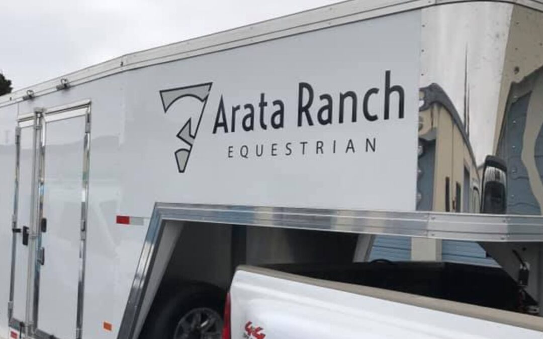
Most wrap advice ends at “make it eye-catching.” That’s not enough, especially if your vehicles spend half their day in downtown stop-and-go, blast up and down Highway 101, idle in school pickup lines, and park at weekend farmers’ markets. The same van can pass ten thousand eyeballs a week and still underperform if the design ignores where and how it’s seen. This guide shows Santa Rosa businesses how to tailor vehicle wraps to real routes and real viewing conditions, so more people notice, read, and act.
Think Like a Route Planner, Not Just a Designer
Before color palettes and hero photos, map the contexts your vehicle actually lives in:
- Downtown stop-and-go (Old Courthouse Square, 4th Street): Short sight distances, pedestrians at arm’s reach, lots of 0–10 mph views.
- Highway 101 & long corridors (Cleveland Ave., Santa Rosa Ave.): Higher speeds, longer but briefer sightlines; rear views dominate.
- School pickup lanes (Steele Lane, Montgomery Village area): Repeated low-speed exposure, parents on foot near the curb, ideal for QR/NFC.
- Weekend events & farmers’ markets (Luther Burbank Center, Santa Rosa Original Certified Farmers Market): Parked impressions, selfies, and dwell time.
Each context rewards different hierarchy, font sizes, contrast strategies, and calls to action. Route-tuned wraps make the same miles generate more leads.
Speed vs. Readability: What Works at 5, 25, and 55 mph
Design clarity isn’t binary; it’s speed-dependent. Use these practical, field-tested targets:
At 5 mph (curbside, parking lots, markets)
- Copy budget: You can support a short tagline plus a CTA.
- Letter height: Plan for ~1 inch of letter height per 10 feet of viewing distance (rule of thumb). A 3–4″ phone number reads comfortably across a two-lane street.
- Graphics: Icons and product photos can live here; people have time to parse them.
- CTA: QR codes and NFC tags shine, your audience is close and (often) stationary.
At 25 mph (arterials, roundabouts, neighborhood corridors)
- Copy budget: Business name + core service + one CTA. Keep total side-panel text to 10–12 words.
- Letter height: 5–7″ for the brand name; 3–4″ for the service line.
- Graphics: Bold color blocks and large shapes beat detail. High-contrast is king.
At 55–65 mph (US-101)
- Copy budget: Logo + one ultra-simple CTA. That’s it.
- Where to place it: The rear is your #1 conversion zone; traffic sits behind you.
- Letter height (rear): 6–8″ for phone/URL to be legible at highway following distances.
- Pro move: Use a plain, high-contrast field behind the CTA—no textures, photos, or busy patterns.
Route-tuned tip: Design your wrap in three hierarchies, rear (conversion), driver/passenger sides (brand + service), and micro-zones for low-speed CTAs (QR/NFC near handles or fuel door area).
Local Sightlines: Garages, Roundabouts, and Long Corridor Stretches
Santa Rosa’s built environment creates predictable viewing angles:
- Multi-story parking (downtown garages, medical centers): A roof or hood accent can be worth it if you regularly park under balconies or upper decks. Consider a bold roof color block with a giant mark, not fine copy.
- Roundabouts & corner approaches: Side graphics are viewed obliquely first. Favor long, lateral color blocks that lead the eye to your brand mark, avoid putting critical text right where the fender flare will warp it.
- Long corridors (Cleveland Ave., Santa Rosa Ave., 101 frontage): Make rear CTAs dead simple and centered at driver eye level. If you must list services, use three max as single words or icons (e.g., Plumb • Heat • Cool).
Avoid seam traps: Don’t cross sliding door splits, fuel doors, or deep body lines with small text. Let art or color flow there; keep words in the flat fields.
Contrast by Time of Day: Dawn, Dusk, and “Not a Safety Vest”
Most fleets run pre-dawn to early evening. Your color strategy should anticipate changing light:
- Dawn/Dusk palettes: Pair deep base colors (navy, charcoal, forest) with light, warm text (cream, light gray) for legibility as ambient light drops. Pure white on pure black can glare under headlights, test at twilight.
- Micro-reflective accents (smart, not loud): Add reflective pinstripes or outlines to letterforms and door-edge graphics so the shape reads under headlights without turning the van into emergency apparatus.
- Matte vs. gloss: Matte reduces glare but can mute color; gloss delivers pop but can reflect surroundings. A satin laminate is a strong middle ground for all-day visibility.
Field test: Park the vehicle at 7:30 a.m. and again at 7:30 p.m., step back 50 feet, and photograph from three angles. If the CTA sinks at either time, adjust the background block or outline weight until it jumps.
Traffic-Aware CTAs: QR/NFC for Slow Zones, Phone/URL for Speed
Calls to action must match the viewing opportunity:
- QR codes: Place where people stop: rear doors (for red lights), sliding door area near the handle (curbside), and on window perf at eye level. Ensure ample quiet space and at least 1″ modules for easy scan from a few feet away.
- NFC tags: Best for markets, events, job sites, and service visits where someone can tap within 1–2 inches. Hide tags under a small “Tap to…” graphic patch so you can update landing pages without reprinting big panels.
- Phone numbers: Rear centerline, 6–8″ tall, with huge contrast. Use a tracking number unique to the vehicle or route.
- Vanity URLs: Keep it short (e.g., Brand.com/Van). Add UTM parameters to isolate wrap traffic in analytics. For highway exposure, a simple URL beats a QR.
Don’t split attention: Pick one dominant CTA per panel. Side = branding + service; rear = action.
Micro-A/B Testing: Let the Route Pick the Winner
You don’t need new wraps to optimize. Build modularity into the design:
- Swapable CTA strips: Print phone/URL/QR on a replaceable overlay. Test white on blue vs. black on yellow, or stacked vs. single-line number, per vehicle or per route.
- Route-specific messages: “Same-Day Service” for neighborhoods where you can actually fulfill it; “Free Estimates” on commuter corridors to prompt quick calls.
- Measure weekly: Log calls to the dedicated numbers, QR scans, and URL sessions. After 3–4 weeks, roll the winning variant fleet-wide.
Low-friction ops: Keep a small kit of pre-printed CTA strips at your shop. Swapping them takes minutes and costs a fraction of reprinting large panels.
Mini Case Slice: A Small Change, Real Lift
A local service van (composite example based on real projects) ran a handsome design, but the rear door stacked the logo above the phone number on a photo background. Commuters on 101 saw the art, not the action.
The change: We flipped the hierarchy, big phone number centered on a plain, high-contrast block, logo below, and trimmed the services list from five to three icon bullets.
The result (8 weeks): Calls to the rear-door tracking number rose ~18% on morning and evening commute routes, with no other media changes. Same miles, better hierarchy.
Practical Layouts by Context (Use as a Checklist)
Downtown & markets (0–10 mph)
- Side: Brand + service + short tagline (≤12 words total)
- Micro-CTA near curbside door: QR + NFC “Tap for menu/estimate”
- Imagery allowed (one strong photo max)
Arterials (15–35 mph)
- Side: Brand (largest) + single service line + one CTA (URL or phone)
- Keep background simple; avoid photo textures under copy
Highway 101 (55–65 mph)
- Rear: Giant phone or URL on a solid block; logo secondary
- No fine detail; no gradient behind the number; add subtle reflective outline
Build for Maintenance and Longevity
Route-tuned wraps should be field-tolerant:
- Edge discipline: Keep critical copy at least 1″ from door edges and body seams. Fewer stress points = fewer touch-ups.
- Panel planning: Put swappable content on separate overlays so updates don’t risk lifting big panels.
- Care SOPs: Train drivers to hand-wash with pH-neutral soap, keep a microfiber and quick-detailer in the cab, and report any edge lifts early.
Measure What Matters
If you don’t track it, you can’t improve it.
- Unique phone per vehicle/route: Use call-tracking to see which corridors convert.
- Vanity URLs with UTM: Create dashboards in Google Analytics for wrap traffic.
- QR/NFC dashboards: Most platforms report scan/tap by time and location—gold for route planning.
- Simple CRM note: Add “Saw vehicle” as a lead source and review close rates quarterly.
After 90 days, you’ll know what colors, hierarchies, and routes pull their weight—and what needs a swap.
Why Route-Tuned Beats “One-Size-Fits-All”
Two vans with identical mileage can perform very differently. The winner typically:
- Puts conversion weight on the rear for highways.
- Uses high-contrast fields behind CTAs (no busy art).
- Limits side copy to a brand + service and one action.
- Employs modular strips for rapid A/B iterations.
- Matches QR/NFC to low-speed zones, not high-speed corridors.
That’s route-tuned design: not louder, smarter.
Ready to Turn the Same Miles into More Leads?
Bring us your routes and we’ll bring the plan. TNT Signs and Graphics will map your driving reality, mock up route-specific hierarchies, and build modular CTAs you can A/B test without rewrapping the vehicle. We’ll also set up tracking (unique numbers, vanity URLs, QR/NFC analytics) so you can see results in black and white.
TNT Signs and Graphics
📍 1042 Hopper Avenue 3-F, Santa Rosa, CA 95403
📞 (707) 528-8523
🌐 signservant.com


