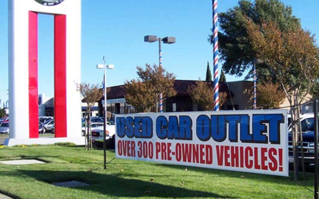
Custom banners are a powerful tool for businesses looking to increase brand visibility, promote special events, and convey messages effectively. Whether displayed at trade shows, storefronts, or outdoor events, banners can capture attention and leave a lasting impression on potential customers. However, not all banners are created equal. To truly maximize the impact of your custom banners, careful consideration must be given to their design. In this blog, we’ll explore design tips and best practices for creating eye-catching displays that grab attention, effectively convey your message, and enhance your brand’s visibility.
The Importance of Custom Banners in Marketing
Before diving into design tips, it’s important to understand why custom banners are such a valuable marketing tool. Banners are versatile, cost-effective, and can be used in a variety of settings to achieve different marketing goals.
Versatility and Reach
Custom banners can be used in numerous environments, including trade shows, corporate events, retail stores, and outdoor advertising. Their portability allows them to reach different audiences and adapt to various marketing needs. Whether you’re promoting a new product, announcing a sale, or enhancing brand awareness, banners can be tailored to fit any occasion.
Cost-Effective Marketing
Compared to other forms of advertising, banners offer an excellent return on investment. They are relatively inexpensive to produce, yet they provide high visibility and can be reused multiple times. This makes them an ideal choice for businesses looking to maximize their marketing budget.
Brand Recognition
Well-designed banners can significantly enhance brand recognition. By consistently using your brand’s colors, logos, and messaging, banners help reinforce your brand identity and make your business more memorable to consumers.
Designing Eye-Catching Custom Banners
Creating a banner that stands out and effectively communicates your message requires a combination of creativity, strategic thinking, and attention to detail. Here are some essential tips to help you design custom banners that maximize impact.
1. Understand Your Audience
The first step in designing an effective banner is to understand your target audience. Consider who will be viewing the banner, where it will be displayed, and what message you want to convey. Understanding your audience will help you tailor the design to resonate with them and meet their needs.
Define Your Objective
Clearly define the objective of your banner. Are you promoting a product, announcing an event, or driving traffic to your website? Knowing your goal will guide the design process and ensure that every element of the banner aligns with your desired outcome.
Consider the Viewing Environment
Think about where your banner will be displayed. Will it be indoors or outdoors? At eye level or above a crowd? Understanding the environment will help you make design choices that enhance visibility and readability.
2. Keep It Simple and Focused
One of the most common mistakes in banner design is trying to include too much information. To make a strong impact, it’s important to keep the design simple and focused on a single, clear message.
Limit Text
Use concise and impactful language to convey your message. Avoid cluttering the banner with too much text, as this can overwhelm viewers and dilute the impact of your message. Instead, focus on a few key points that are easy to read and understand at a glance.
Use Clear Calls to Action
If your banner’s goal is to prompt a specific action, such as visiting a website or attending an event, make sure the call to action (CTA) is clear and prominent. Phrases like “Sign Up Today,” “Visit Our Website,” or “Limited Time Offer” should stand out and be easy to read.
3. Optimize for Readability
A banner’s primary purpose is to communicate a message quickly and effectively. To achieve this, readability is key. Here’s how to ensure your banner is easy to read from a distance:
Choose the Right Font
Select fonts that are clear and legible from a distance. Sans-serif fonts, such as Arial or Helvetica, are often preferred for banners because they are clean and easy to read. Avoid overly decorative or script fonts that may be difficult to decipher.
Font Size Matters
The size of your text should be proportionate to the size of the banner and the distance from which it will be viewed. As a general rule, larger text is better for banners, especially for headings and key messages. A good starting point is to use a font size of at least 72 points for main headings.
High Contrast
Ensure there is sufficient contrast between the text and the background to make the words stand out. Dark text on a light background or light text on a dark background is usually a good choice. Avoid using colors that blend into each other, as this can make the text hard to read.
4. Use Bold and Vibrant Colors
Color plays a crucial role in attracting attention and conveying your brand’s personality. Here’s how to use color effectively in your banner design:
Align with Brand Colors
Use your brand’s colors to maintain consistency across all marketing materials. This not only reinforces your brand identity but also helps customers instantly recognize your business.
Create Visual Impact
Choose bold and vibrant colors that stand out and catch the eye. However, be mindful of using too many colors, as this can make the design look cluttered and chaotic. A good rule of thumb is to stick to two or three main colors that complement each other.
Consider the Psychology of Color
Different colors evoke different emotions and responses. For example, red is often associated with excitement and urgency, while blue conveys trust and professionalism. Consider the psychological impact of the colors you choose and how they align with your message.
5. Incorporate High-Quality Images and Graphics
Images and graphics can enhance the visual appeal of your banner and help convey your message more effectively. However, it’s important to use them wisely:
Use Relevant Images
Choose images that are directly related to your message or product. Irrelevant or generic images can confuse viewers and weaken the impact of your banner. If you’re promoting a specific product, feature a high-quality image of that product prominently on the banner.
Ensure High Resolution
Low-resolution images can appear blurry or pixelated when printed on a large banner, which can detract from the overall quality. Always use high-resolution images and graphics to ensure they look sharp and professional.
Balance Images with Text
While images are important, they should not overpower the text. Make sure there is a good balance between visuals and text so that both elements work together to convey your message.
6. Consider Banner Placement and Size
The placement and size of your banner can greatly influence its effectiveness. Here’s what to keep in mind:
Choose the Right Size
The size of your banner should be appropriate for its location. A banner that is too small may go unnoticed, while one that is too large may be overwhelming or difficult to display. Measure the space where the banner will be placed and choose dimensions that fit well.
Positioning for Maximum Visibility
Place your banner in a location where it will be easily seen by your target audience. For outdoor banners, consider high-traffic areas such as busy streets, intersections, or event entrances. For indoor banners, place them at eye level or above head height to ensure they are visible from a distance.
7. Ensure Durability and Longevity
Finally, it’s important to consider the materials and printing techniques used to produce your banner. Durability is especially important for outdoor banners that will be exposed to the elements.
Choose Weather-Resistant Materials
For outdoor banners, use materials that are resistant to weather conditions such as rain, wind, and sunlight. Vinyl is a popular choice for outdoor banners due to its durability and ability to withstand harsh conditions.
Use UV-Resistant Inks
To prevent colors from fading over time, especially in outdoor settings, use UV-resistant inks. These inks are designed to withstand prolonged exposure to sunlight, ensuring that your banner remains vibrant and eye-catching.
Reinforce Edges and Add Grommets
To ensure your banner stays in place, especially in windy conditions, reinforce the edges with hemming and add grommets (metal rings) for easy hanging. This will help prevent the banner from tearing and extend its lifespan.
Custom banners are a versatile and effective marketing tool that can significantly enhance your brand’s visibility and impact. By following these design tips and best practices, you can create eye-catching banners that grab attention, convey your message clearly, and leave a lasting impression on your audience.
At TNT Signs, we specialize in creating high-quality custom banners that are tailored to meet your specific marketing needs. Whether you need a banner for a trade show, storefront, or outdoor event, our team of experienced designers and printers is here to help you create the perfect display. Contact us today to learn more about our custom banner solutions and how we can help you maximize the impact of your marketing efforts. Let’s make your message stand out!


