If you’ve ever followed a service van through a Santa Rosa intersection and actually saved the number at the light, you’ve experienced a rare thing: a vehicle wrap that truly works. Most wraps are attractive from three feet away on a laptop screen; very few are built to communicate in the wild, through glare, rain, odd angles, and seven seconds of attention. The difference isn’t luck or a fancier printer. It’s a design discipline grounded in layout, messaging, and visual hierarchy.
This is your practical, real-world guide to building a wrap that reads fast, looks great, and turns miles into leads.

The seven-second reality
A typical viewer meets your brand for the first time from two car lengths back at a red light. You have about seven seconds to answer three questions:
- Who are you?
- What do you do?
- What should I do next?
Anything that gets in the way, ornate scripts, long lists, soft contrast, tiny phone numbers, costs you the moment. An effective wrap is engineered to make those seven seconds effortless.
One vehicle, three micro-billboards
Think of your vehicle as three separate “screens,” each with a job.
The rear is your conversion zone. It gets the longest stare at stoplights and in traffic, so your primary call-to-action belongs here, either a phone number or a short URL. Not both. Make it the biggest element on the rear and place it on a solid, high-contrast block so it stays readable at noon and at dusk, in rain and in glare. Your logo supports the call-to-action, not the other way around. A tiny line of proof, three words or three icons such as Licensed • Insured • 24/7, is plenty.
The curbside (passenger) is your interaction zone. This side serves slow-speed moments: curb parking, job sites, deliveries, event queues. It’s the best place for a QR code or NFC tap that opens online booking, estimates, or menus. A single benefit line, twelve words or fewer, gives context without slowing anyone down.
The street side (driver) is your flyby zone. Cars pass this side quickly. Keep it simple: brand + category (e.g., “North Bay Roofing”) and a compact promise (“Leak Repairs Fast”). The goal is recognition, not conversion.
When every panel has just one job, clutter falls away and your message lands.
Visual hierarchy: Who gets to be the star?
Hierarchy is the order in which a stranger’s eye meets the information. On a high-performing wrap, the call-to-action is the star of the rear panel. The brand name plays best-supporting actor. Proof points are the extras. That may feel counterintuitive, many teams want the logo tallest—but the road is ruthless. Big logo, tiny phone number is a nice poster. Big phone number, supportive logo is a working ad.
You’ll know you’ve nailed hierarchy when a teammate glances at a mockup from across the room and can repeat the number (or URL) out loud without squinting. If they can’t, the audience in traffic won’t either.

Messaging that moves
Wraps are not brochures. Nobody has time for “family-owned, customer-centric, industry-leading” while changing lanes. Choose one action (call or visit a short URL), write one clear benefit line for the sides, and ditch the rest. “We Care” is wallpaper; “Same-Day Water Heater Install” is a reason to act. Make every word earn its space.
A small but mighty tactic: if your brand relies on inbound calls, pick a phone-friendly typeface with clear numerals (no ambiguous 1/I or 0/O). If you book online, invest in a memorable, short URL that’s easy to type at a glance.
Layout that works at 50 feet (not just at 100% zoom)
Design reviews typically happen at arm’s length on bright monitors. Real life happens at distance. A reliable rule of thumb: about one inch of letter height per 10 feet of viewing distance. For two car lengths (40–60 feet), the rear phone number or URL should be 6–8 inches tall. The brand name sits comfortably at 3–4 inches. Side headlines live between 4–6 inches to catch curbside readers.
Before you approve final art, do the old-school test: print the rear call-to-action at full size on paper, tape it to the vehicle, and step back 50 feet at noon and again at dusk. If it fuzzes out in either condition, it isn’t big enough yet.
Equally important: keep small type off seams and hardware. Door gaps, barn-door splits, handles, sensors, wipers, deep curves, these are the enemies of letterforms. The cleanest design in the world fails if the “7” in your phone number straddles a seam.
Contrast is king (and always will be)
Color is brand personality; contrast is legibility. If your message doesn’t separate sharply from its background, it won’t be read, especially in mixed lighting and rain.
High-performing pairs are simple: white on navy/charcoal/black or navy/black on white/yellow. If your palette leans mid-tone on mid-tone (e.g., teal on royal), introduce a neutral CTA plate behind essential text. That one rectangle is the cheapest insurance you can buy for real-world readability.
At night, glare can bloom thin strokes into oblivion. A satin laminate tames reflections without dulling color. If your routes include lots of dawn/dusk driving, a subtle reflective keyline around the CTA plate or digits adds nighttime pop without looking like emergency striping.
Typography that survives motion and glare
Screen-friendly type is not always road-friendly. Choose a clean sans-serif with sturdy strokes and clear numerals. Thin scripts, hairline serifs, and ultra-condensed styles look elegant on proof sheets and disappear at speed. Bump weight one notch heavier than you’d choose for print, and open the letter spacing slightly for digits and URLs so strokes don’t blur together in a quick glance.
Images, textures, and the discipline to say “No”
Photos and textures are spice, not the meal. Use one hero image per side at most, and never let it sit behind critical text. If you must overlay, fade the image to a whisper, 10–20%, and plant your type on a solid field. Faces and fine product details don’t belong on bumpers or wheel arches; stretch and curve will distort them. When in doubt, let color blocks and bold type carry the story.
Smart interactivity (where it actually works)
A QR code is brilliant when people can stand 2–6 feet away, curbside doors, loading areas, long stoplights. Print it at about 1.25–1.5 inches with generous quiet space and a solid background, and point it to a trackable landing page. NFC tags shine at events and curbside pickup, “Tap to order” or “Tap for estimate”, mounted exactly where a hand naturally reaches. Don’t scatter scannables across every panel; one per side is plenty.
Materials and finishes that support the message
A legible design still needs the right materials to stay legible. Cast film with a matched laminate conforms to curves and resists shrinkage; a satin finish often strikes the best balance between color pop and glare control. In high-touch urban routes, anti-graffiti laminates make cleaning easy. Wrap-safe ceramic toppers keep surfaces slick so grime releases faster and UV fade slows down. Always proof color on your actual paint color outdoors; paint tone can shift how wraps read.
Approve in the conditions you’ll be seen
Sign-off indoors is not enough. Build a quick four-step field test into your process:
- 50-foot read at noon and dusk (full-size CTA printout).
- Glare check in bright sun and under streetlights; adjust finish or plate contrast if digits bloom.
- QR scan in flat light and drizzle; if it fails, enlarge it and add quiet space.
- Seam map with tape on the actual vehicle; make sure no thin strokes cross trouble zones.
If your layout passes those tests, it’s road-ready.
Make performance measurable (so you can improve it)
Good wraps get better when you track them. Use a unique call-tracking number on the rear. Drive traffic to a vanity URL with UTM parameters. Use a dynamic QR code you can redirect as promotions change. Read calls, sessions, and scans monthly, and change one variable at a time, CTA wording, plate color, phone vs. URL, so you learn what actually moves the needle.
A pro tip that saves budget: print the CTA plate and any promo windows as swappable overlays. You can test bold ideas in minutes without tearing up perfectly good panels.

A quick case snapshot
A home-services contractor came to us with a handsome rear design: oversized logo, tasteful photo background, neat phone number… that vanished every evening. We moved the number onto a solid navy plate, increased its height to 8 inches, trimmed the services list to three icons, and reduced the logo. Route, spend, and mileage stayed the same. Over the next eight weeks, calls to the tracked rear number climbed double digits. Same miles. Better hierarchy.
The seven-second checklist
If you remember just one takeaway, let it be this checklist. Pin it above your desk and don’t hit “print” until every box is checked:
- One dominant call-to-action on the rear, 6–8″ tall
- High-contrast CTA plate behind digits/URL
- Brand smaller than the CTA; max three proof words/icons
- Side copy ≤12 words; QR/NFC only where people stand still
- No thin strokes crossing seams, handles, or curves
- Tested at 50 ft in noon and dusk light; photos head-on and angled
- Satin finish considered for glare control
- Tracking built in (unique phone, vanity URL + UTM, dynamic QR)
- CTA/promo produced as replaceable overlays for fast A/B tests
Do that, and your wrap stops decorating and starts performing.
Ready to turn your miles into marketing?
Bring your route map, a snapshot of your vehicle, and any draft art. We’ll run the 50-foot tests with you, map seams around your body lines, spec materials for North Bay conditions, and design modular CTA overlays so you can keep optimizing without a full rewrap.
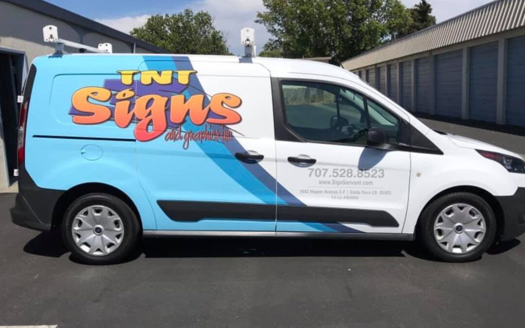
TNT Signs and Graphics
📍 1042 Hopper Avenue 3-F, Santa Rosa, CA 95403
📞 (707) 528-8523
🌐 www.signservant.com
Design for the road, not the monitor, and watch every stoplight become a chance to win a customer.