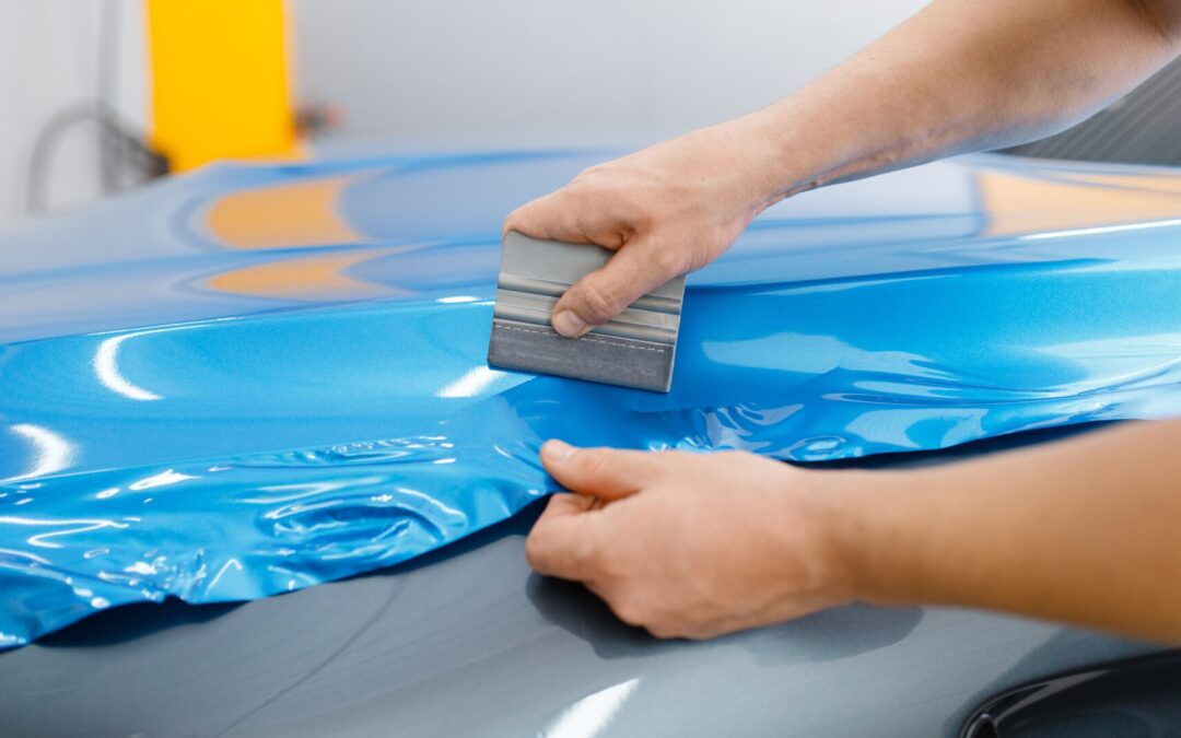
When a vehicle wrap is executed well, it does more than “look cool”, it becomes a moving billboard, a rolling piece of your brand that captures attention, communicates value, and drives action. But crafting an effective wrap isn’t just about slapping your logo on a van and calling it a day. To truly maximize impact, every element, from the way graphics flow across doors to the words you choose and how your eye travels across the design, must work in harmony. In this blog, we’ll explore the three pillars of an effective vehicle wrap strategy: thoughtful layout, compelling messaging, and strategic visual hierarchy. Whether you’re a small business owner, a marketing professional, or simply someone curious about the art and science behind mobile advertising, read on to discover how to transform your vehicle into a powerful, high-impact marketing tool.
Designing the perfect layout
At its core, layout dictates where each design element lives on your vehicle’s surface: which panels carry your logo, where key text appears, and how graphics navigate curves, seams, and wheel wells. A smart layout turns everyday traffic patterns into marketing opportunities.
Understanding vehicle
Every vehicle has its own set of canvases. The side panels, doors, hood, roof, and rear gate each serve different functions:
- Side panels are your largest exposure opportunity. On city streets and highways, other drivers and pedestrians see these broad surfaces first. Reserve this space for your primary graphic, a vivid logo or signature image that communicates your brand at a glance.
- Rear surface catches traffic stuck at red lights or tailgaters behind you. This is ideal for the call-to-action: phone number, website URL, or QR code. Keep text large and legible to ensure it registers in those fleeting seconds.
- Hood and roof might be overlooked in motion but shine when parked, at events, curbside pickups, or outdoor gatherings. A subtly branded hood wrap extends visibility without overwhelming the main side panels.
Windows, when covered with perforated vinyl, offer additional space for secondary messaging, hours of operation, social media handles, or brief taglines, while still allowing driver visibility.

Flowing with curves and contours
Vehicles aren’t flat billboards. Carefully mapped layouts account for door seams, wheel arches, and recessed panels:
- Core brand elements should avoid deep recesses to prevent distortion.
- Use wrap software or 3D mockups to preview graphics on your specific make and model, ensuring that logos don’t wrap around handles or get split at seams.
- Align key text along straight, level surfaces to maintain readability from multiple angles.
Balancing Bold Impact and White Space
A common mistake is cramming too much information onto a wrap. White space isn’t wasted space, it’s breathing room that makes your design pop:
- Anchor your brand name or logo in a dominant zone, surrounded by ample contrast.
- Use solid background fields (one or two brand colors) rather than busy patterns, which can muddy your message.
- Position high-impact graphics where they’ll be seen most often, doors for city driving, rear panels for stop-and-go traffic.
Crafting clear, compelling messaging
Once your layout is sketched, it’s time to think like a copywriter. Effective messaging on a moving vehicle adheres to one simple rule: less is more.
The rule of three (Plus one)
Your wrap should communicate:
- Who you are (Logo/business name)
- What you do (Core service or value proposition)
- How to reach you (Phone number or website)
Add a fourth element, a brief call-to-action like “Call Now,” “Book Today,” or “Visit Our Site”, to drive immediate engagement. Keep all text under five words per line, and limit the total word count to around 10–12 words for optimal legibility at speed.
Taglines and differentiators
If your brand has a well-known tagline or unique selling point, “Locally Owned Since 1985,” “Free On-Site Estimates,” “Emergency Service 24/7”, position it in a secondary zone, beneath or beside your core message. This builds credibility without distracting from the essentials.
Leveraging icons and imagery
Simple, universally recognized icons (a phone receiver for calls, a globe for websites) can replace words or accentuate messaging. High-resolution product images can work wonders on food trucks or real estate vans but should remain uncluttered and not cover more than 25% of the visible real estate to maintain quick readability.

Establishing visual hierarchy
Visual hierarchy guides the viewer’s eye through your wrap in a deliberate order. It uses scale, contrast, and placement to ensure the most critical information lands first.
Size and scale matter
- Primary element (Logo/Name): Make this the largest text or graphic on your wrap. It should be easily read from 20–30 feet away.
- Secondary element (Descriptor/Tagline): About half the size of your primary element. It clarifies what you do.
- Tertiary element (Contact Info): Slightly smaller, but still legible from 10–15 feet. Use bold or high-contrast colors to help it stand out against background colors.
Color and contrast
- High-contrast pairs, white on dark blue, black on yellow, or orange on black, ensure your text jumps off the vehicle surface, even in low light or rainy conditions.
- Accent colors draw attention to calls-to-action. A bright red phone number against a neutral background is a common favorite for a reason: it works.
Placement and eye flow
- Use a “Z” or “F” pattern based on vehicle shape. On a horizontal side panel, eyes naturally move left to right, then diagonally down. Position your logo in the upper front, your descriptor in the center, and contact info in the lower rear.
- Avoid placing critical text in areas where eyes are least likely to linger, such as door jambs or below rocker panels.
- Incorporate directional cues, arrows, lines, or subtle patterns, that nudge the viewer’s gaze toward your CTA.
Bringing it all together: A real-world example
Imagine a plumbing company, “AquaFix,” rolling out its first vehicle wrap:
- Layout:
- The side panel boasts a wave graphic in brand blue and green.
- “AquaFix Plumbing” logo sits front-door level in 10” letters.
- A large wrench icon reinforces the service.
- Messaging:
- Underneath the logo: “24/7 Emergency Service” in 4” text.
- On the rear doors: “Call Now: 555-PLUMBER” in 6” bright orange.
- Visual hierarchy:
- Logo (largest, top-left), descriptor (mid-size, center), phone number (smaller, bottom-right, high-contrast).
- White water-drop icons guide the eye from logo to tagline to contact.
Within weeks of debuting, AquaFix reports a 35% increase in phone calls—many citing the “new van design” as why they reached out. This success underscores how an expertly executed layout, streamlined messaging, and intentional hierarchy convert looks into leads.
Conclusion
An effective vehicle wrap is far more than a moving decoration. It’s a strategic marketing asset that requires careful planning of layout, mastery of concise messaging, and a precise visual hierarchy to ensure your brand is seen, remembered, and acted upon. By respecting the principles outlined above, leveraging every inch of your vehicle’s canvas, crafting bite-sized copy, and guiding the viewer’s eye through size, contrast, and placement, you’ll create wraps that not only turn heads but also deliver measurable business results.
Ready to make your next vehicle wrap campaign a roaring success? Contact TNT Signs and Graphics at (707) 555-1234 or visit www.tntsignsandgraphics.com for a free design consultation. Let our expert team help you craft a wrap that captures attention, communicates clearly, and drives your brand forward,one mile at a time.