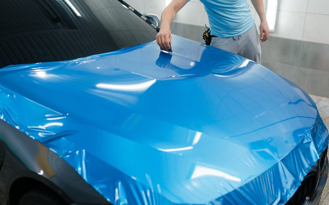
A vehicle wrap lives in the real world, moving traffic, stoplights, sun glare, rain, and people who only grant your brand a few seconds of attention. The wraps that win aren’t the prettiest on a monitor; they’re the ones that communicate instantly from 20, 40, or 60 feet away. After designing and evaluating thousands of wraps, the same three failures show up over and over: poor readability, visual clutter, and weak contrast. Get these right and your wrap becomes a lead engine; get them wrong and you’ve paid for rolling wallpaper.
This guide breaks down each mistake, explains why it happens, and gives you simple, field-tested fixes you can apply before you hit “print.”

Mistake #1: Readability that falls apart at real distances
Most wrap proofs are approved at 100% zoom on a bright screen, basically nose-to-glass. Real life is different. Drivers view your message from car lengths away, through rain, across glare, and often at an angle. If your words can’t be read fast, the design failed no matter how gorgeous the gradients are.
Why it happens
- Fonts chosen for style, not legibility (thin scripts, high-contrast serifs, ultra-condensed sans).
- Type sized for a laptop, not a lane of traffic.
- Copy running across seams, handles, and deep curves, which break letterforms.
- Busy photo textures behind text.
- Gloss glare that turns white letters into streaks at noon or at night under headlights.
Field rules that actually work
- Letter height vs. distance: Plan about 1 inch of letter height per 10 feet of viewing distance.
- Rear phone/URL: 6–8″ tall so it reads clean at 40–60 ft (two car lengths).
- Brand name (rear): 3–4″.
- Side headlines seen curbside: 4–6″.
- Typeface choice: Use a humanist or geometric sans with medium/bold weight for headlines and digits; avoid ultra-thin, condensed, or ornate scripts for core messaging.
- Stroke & spacing: Slightly increase tracking for digits and URLs; tight letter spacing smears at a glance.
- Panel-aware copy: Keep phone, URL, and service bullets on flat metal, not over handles, license plate indents, sensor cutouts, or deep curves.
- Finish matters: A satin laminate often beats gloss for legibility by reducing glare without killing color.
Quick fixes
- Promote the CTA (phone/URL) to the rear as your #1 message and make it the largest element.
- Move small text off seams; reflow into a clean block.
- If your chosen font gets wispy, pick the next heavier weight or a more legible family.
- Add a CTA plate, a plain, high-contrast rectangle behind your digits/URL, to keep them readable in any condition (more on contrast below).
Mistake #2: Clutter, Saying everything, so nothing lands
When you list twelve services, three taglines, five social icons, a QR code, and a full photo montage, you’re asking a moving audience to read like they’re in a waiting room. They won’t. Clutter turns a wrap into a puzzle; prospects will tune out before they find the one thing you needed them to do.
Why it happens
- Internal stakeholders push their own message onto the vehicle.
- Fear of leaving anything out (“What if someone doesn’t know we also do X?”).
- Confusing a vehicle wrap with a brochure.
The seven-second reality
From behind you at a stoplight, a stranger has ~7 seconds to notice, decode, and act. Your layout must behave like a landing page: one goal, one action, ruthless hierarchy.
A simple, high-converting hierarchy
- Primary CTA (rear): phone or short URL—big and unmissable.
- Brand mark/name: smaller than the CTA but clearly visible.
- Micro-proof: three icon bullets max (e.g., HVAC • Plumbing • 24/7).
Everything else (slogan, long service list, social handles) belongs on the website or inside a brochure, not on the back of a moving van.
Side panels: Teaser, not textbook
- 12 words or fewer on a side panel that someone sees walking or at a slow roll.
- One strong image or texture is fine—but keep copy off the busy area.
- Put secondary CTAs (QR to estimate form, NFC tap for menu) on curbside doors where people stand still.
Quick fixes
- Cut your message list in half, then cut it again.
- Convert long lists into three category bullets with icons.
- Make the CTA plate the visual “home base” and give it white space.
- Remove social rows unless a single handle is core to your strategy (and even then, keep it small).

Mistake #3: Bad contrast, pretty on a proof, invisible on the road
Color is emotion, and physics. Weak contrast kills legibility, especially in dawn/dusk, rain, or under headlights. Many wraps that look beautiful indoors completely disappear outside.
Why it happens
- On-screen approvals in perfect lighting rather than field tests.
- Trendy palettes with low contrast (pastel on pastel, gradient over gradient).
- White letters on glossy white highlights, or dark letters over a textured photo.
- No consideration of time of day or weather on the route.
Contrast combinations that win
- Light on dark or dark on light, no in-betweens for core text.
- Durable pairs: white on navy/charcoal, black on yellow, navy on white.
- Avoid “vibrating” combos (saturated red on blue, green on red) that strain the eye.
Night and rain strategy
- Use satin to reduce glare bloom at night and under streetlights.
- Add micro-reflective keylines (a slim reflective outline around the CTA plate or digits) for a subtle edge pop, professional, not “safety vest.”
- Give QR codes a solid light or dark square with generous quiet space; muddy edges won’t scan in drizzle.
Quick fixes
- Put the digits/URL on a solid CTA plate in the highest contrast available in your brand palette.
- Nudge brand colors slightly warmer/cooler to increase contrast without going off-brand.
- If you must overlay type on an image, screen the image down to 10–20% and maintain a clean text block.
Panel-by-panel guidance (where each element belongs)
Rear (your money panel):
- Dominant CTA plate with phone or short URL at 6–8″ tall.
- Brand mark below or above at half the size.
- Three icon bullets tops.
- Keep everything off seams and hardware. If you have barn doors, ensure numbers don’t split across the gap.
Curbside (passenger) door:
- Secondary CTA for low-speed interactions: QR to booking/menu, NFC “tap to schedule.”
- Short proof point or promo panel that can be updated seasonally.
Street side (driver):
- Simplest message—brand + line of business—since scan time is shortest.
Hood/Roof:
- Skip unless you regularly park where multi-story views matter (garages, arenas). If you do wrap them, keep it brand-only for scale and avoid essential CTAs.
Before-you-print tests you should never skip
- 50-foot test (noon & dusk): Print a full-size mock of the rear CTA block on bond paper and tape it to the vehicle. Step back 40–60 ft. If digits or the URL fuzz out, adjust size/contrast.
- Angle test: View the CTA from 15–30° off-center to mimic neighboring lanes. Letters that looked fine head-on can distort at an angle.
- Glare test: Take photos at midday and under streetlights after dark. If the CTA blooms, consider a satin finish or a darker plate.
- Seam overlay: Lay painter’s tape where seams/handles land. Make sure no thin strokes cross those lines.
- Scan test: Try the QR in poor light and light rain. If it fails, enlarge it and add quiet space.
Make it measurable (So you can make it better)
Even a great design can be great-er once you track it.
- Dedicated rear phone numbers per vehicle or route.
- Vanity URLs with UTM tags, e.g., Brand.com/Book (your analytics captures source=wrap).
- Dynamic QR codes you can redirect as promos change.
- Monthly five-minute readout: calls, sessions, scans. A/B test one variable at a time (CTA wording, plate color, phone vs. URL).
- Modular overlays: Print the CTA plate as a replaceable strip so you can swap winners across the fleet in minutes, not days.
Quick troubleshooting: If performance is soft
- Low calls/scans in dusk or rain? Increase contrast on the CTA plate, switch to satin, or add a thin reflective keyline.
- Lots of impressions, few actions? You might have clutter. Reduce to one CTA, enlarge it, and remove the service list.
- People misread phone digits? Increase tracking and choose a clearer numerals set (some fonts have ambiguous 1/I or 0/O).
- QR underperforms? Enlarge it, add quiet space, move it to the curbside door where people are within 2–6 feet.
A mini case: The 18% lift from one change
A home-services van had all the right ingredients, brand, phone, services, but the phone number sat over a textured photo and crossed a door seam. We moved the number to a solid navy CTA plate, set it at 8″ tall in a bold sans, reduced services to three icons, and dropped the logo size. With no other media changes, calls to the rear tracking number rose about 18% over eight weeks on commute routes. Same miles. Smarter hierarchy and contrast.
A designer’s checklist (Pin this above your desk)
- One dominant CTA on the rear (phone or short URL), 6–8″ tall
- High-contrast CTA plate, no textures behind digits/URL
- Brand mark smaller than the CTA
- Max three icon bullets; no long lists
- Side copy ≤ 12 words; QR/NFC on curbside door only
- No thin strokes across seams, handles, curves
- Satin laminate considered for low-glare readability
- Proofs tested at 50 ft in noon and dusk conditions
- Tracking assets (unique number/UTM/QR) built into the art
CTA plate printed as a replaceable overlay for easy A/B
The takeaway
A high-performing wrap isn’t complicated. It’s disciplined. Readability means sizing and type you can digest at a glance. Decluttering means choosing one action and letting it breathe. Contrast means making that action survive glare, rain, and nighttime. Nail those three, and your wrap stops being a pretty picture and starts being the hardest-working ad your business owns.
Want a second pair of eyes before you print?
Bring your draft artwork or even a phone snapshot of your current wrap. We’ll run your design through the 50-foot, dusk, and angle tests; tighten the hierarchy; spec the right laminate; and set you up with modular CTA overlays so you can A/B your way to better results, without rewrapping.
TNT Signs and Graphics
📍 1042 Hopper Avenue 3-F, Santa Rosa, CA 95403
📞 (707) 528-8523
🌐 www.signservant.com