
 Your business needs signs to get noticed. But how should you design them for the optimal effect? Let’s take a look at five of the most important rules to consider for your sign design.
Sign Design Rule #1: Make your sign legible
Although this one seems like a no-brainer, this is actually a common sign design mistake that even sign design experts occasionally make. This is because it’s easy to become enamored with a beautiful font or graphic lettering style that stands out. However, it won’t matter how great or noticeable your sign is if nobody can read enough of the information to learn about your organization or event. Before you settle on a style, make sure that it can be read by people other than those who already know what it’s supposed to say.
Sign Design Rule #2: Make your sign large enough to see
There is no such thing as a one-size fits all solution for a sign. How big your sign needs to be depends on a number of factors, including the distance, height and angle that it will be posted at. For example, if you post a sign on the side of a busy road, few people will notice, and even fewer will be able to clearly see a sign that is less than two square feet in size.
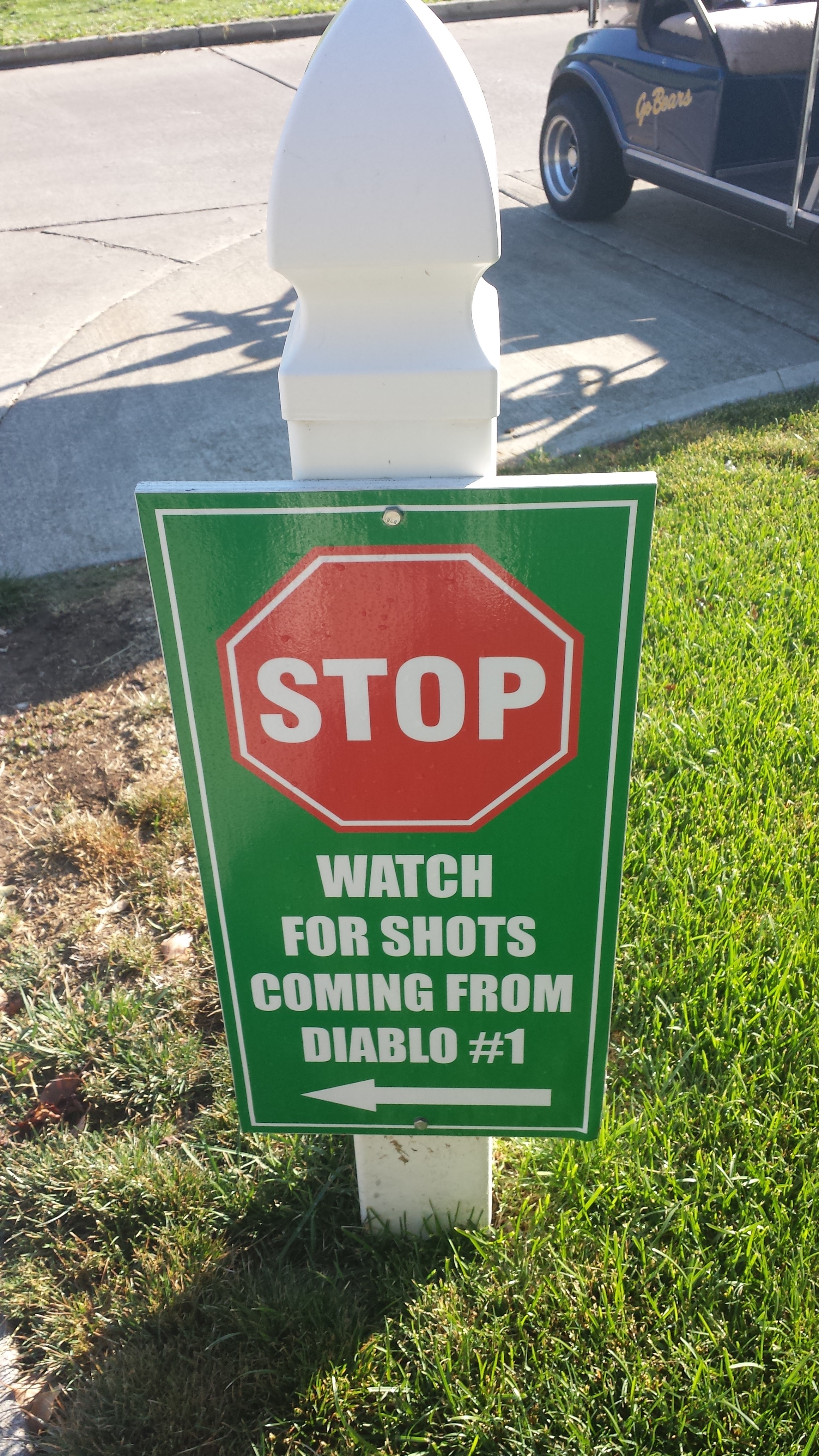
Sign Design Rule #3: Don’t design a sign that blends in with the background
Camouflage is great for military operations, hunting, and staying alive in the wild. That is because it allows a person or animal to blend in. This same benefit, however, does not help you when you are designing a sign that you want to be seen. Make sure that your sign’s colors and shape don’t blend in with the background in which it will be sitting. For example, big, bold, blue letters won’t stand out very much on a big blue van. Also make sure that your sign doesn’t blend in with itself — people won’t be able to read a dark grey sign with black letters.
Sign Design Rule#4: Don’t push your sign over the edge
For good sign design, spacing is a key element. You need to make sure that all of your letters and graphics are spaced out enough to be clearly seen, but you also need to keep the outer edges of your sign in mind. If you don’t you can end up with a missing or chopped off letter or graphic. Although modern printers are extremely accurate, they aren’t perfect; when you try to push the sign design to the edge, chopped off content is exactly what can occur. Also keep in mind that crowded edges look bad anyway.
Sign Design Rule #5: Decide where you want a viewer’s eyes to go
Attracting people’s attention to the sign is just the first step. As Google noted in a recent study, the average attention span is around 50 milliseconds; this means that after you engage a viewer, your sign design only has a split second to deliver the information that you want them to receive. In order to make sure that A. your viewers are getting the right message, and B. your viewers are staring at the sign long enough to get the message in the first place, you need to create a sign design that focuses their attention. This can be done in a variety of ways; you can consult your sign design expert to learn how.
Sign Design Rule #6: Prioritize High-Contrast Colors
Color choice can make or break your sign’s visibility. High-contrast color combinations, like black text on a white background or yellow lettering on dark blue, ensure maximum readability. Avoid pairing colors that are too similar in tone, like pastel pink on white, as they can fade into each other under certain lighting conditions. Think about your sign’s location—whether indoors or outdoors—and how lighting and weather conditions might affect visibility.

Sign Design Rule #7: Use Simple, Impactful Messaging
Your sign isn’t the place for a novel. Keep the message short, impactful, and easy to grasp at a glance. A rule of thumb is to stick to no more than seven words in your headline. For example, “50% Off Winter Clearance – This Weekend Only!” works far better than a paragraph about why your sale is amazing. Customers scanning your sign during their commute or while walking by only have seconds to absorb your message, so make every word count.
Sign Design Rule #8: Incorporate Branding Consistently
A great sign does more than deliver a message—it reinforces your brand identity. Include your company’s logo, colors, and typography in a way that aligns with your overall branding. For example, if your brand uses playful, vibrant colors and rounded fonts, don’t suddenly switch to a corporate, minimalist design on your signage. Consistent branding across all marketing materials, including signs, builds recognition and trust with your audience over time.
How well will your sign design work?
In order to make sure that your organization’s sign provides real results, pay careful attention to how you design it.