Stickers can be a great way of marketing. You can give them away for free, stick them on products, use them to seal bags, and much more. Stickers and decals are a great freebie because they don’t cost a lot to print and are fairly small, so they don’t take up a lot of space. Unlike some marketing items such as flyers, you can actually make use of stickers for some practical purposes, too. For example, restaurants can seal containers or carry out bags with a sticker to show that the food hasn’t been tampered with.
As with any marketing product, though, stickers can be more or less effective depending on their design. Well-designed stickers will raise awareness of your brand or provide information to customers, while stickers that are poorly designed may not accomplish much of anything. If you’re thinking about using stickers in your next marketing campaign, here are some tips for the perfect design. As always, the team at TNT Signs is here to help you with your designs, so if you get stuck, you can give us a call.
The Parts of a Sticker
A sticker is very basic: it has a front with your image on it and a backing that is peeled off when you’re ready to put the sticker on something. Typically, the back is left blank. There is rarely any need to print anything on the back of a sticker because it’s just going to get peeled off and thrown in the trash. Even if you put your business name on it, the back of a sticker isn’t something most people are going to keep, so it’s really not worth the time or money involved in double-sided printing.
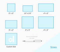
Sticker size is also important. Most stickers are fairly small. Few are more than four inches wide or tall, although there are some exceptions. For example, if you’re designing bumper stickers, the average size is 11.5 inches by 3 inches. That’s much larger than a small sticker you would put on a product or give out as a promotional item. Unless you have a special use in mind, typically keep your stickers to the average size, which is 3.5 inches by 2 inches.
What about shape? Some decals are rectangular, square, or circular/oval, but they don’t have to be. Those are the easiest and least expensive to print because there’s no need to do any cutting. They can be printed on a prepared page. The other option is to create what’s called a die-cut sticker. Instead of being a standard shape, these stickers are cut out around the design. This gets rid of any blank space around the design, but it is more costly and time-consuming because each sticker has to be cut out individually. The end result is usually more interesting, though, since the sticker is shaped like the image printed on it.
What Should Be Included on a Sticker?
There are a number of elements you can include on a sticker, but you may not need every element on every sticker you design. It really depends on what your goal is. Stickers that are designed to market or raise awareness of your brand are going to be a little different than those that are given away to kids to make them excited about a product or event. That said, here are some of the common design elements you will likely want to include on the stickers you design.
Your company name
The first element most people add when they’re designing stickers is the company name. You want the sticker to advertise your business, of course, and that means you need your name on it.
Your location or contact information
Another common element on stickers that are primarily for marketing purposes is your location or way of contacting your business. This doesn’t necessarily mean you need your physical address on the stickers—that takes up a lot of space on your small canvas. Instead, you may want your website address. You might also want to put your phone number or email address. Social media profile names are also good to use, especially if you do a lot of marketing online.
Your logo
If your business name is fairly long or if you can’t make it look right with the photos or graphics you’re using on the sticker, you may want to drop it entirely. If you have a logo that is closely associated with your business name, you can simply put it on the sticker instead. For example, McDonald’s doesn’t always need to use their name—they can put the golden arches logo on a sticker, and everyone recognizes it. Even if you don’t have that type of brand recognition, people in your local area may know what your logo looks like. You may also be able to leave off the name if it’s in your website URL or email address. Just use your logo and either of those.
Graphics
While some stickers can get the job done with text only, adding graphics makes them stand out more and gets people’s attention. Remember that your stickers will be fairly small, so make certain the graphics you intend to use look good at a small size.
Photos
In addition to graphics, you can always add photos to your stickers. Again, you do want to be careful with the size. Photos that are too detailed or that are very large may not be easy to see when reduced to a few inches in size.
Design Tips to Remember
Once you start designing your stickers, there are a few things you want to keep in mind. You don’t want to create a great design only to realize that it doesn’t work on a sticker, so always keep the overall size in mind. You’ll likely want to create the design several sizes larger just so it’s easy on your eyes and to work with. Once that’s done, shrink it down to the print size and see if it still works. Pay close attention to the text size and if it’s still readable. If it isn’t, you’ll need to make some changes.
Don’t Over-Design It
Too much on a sticker can make it hard to read or understand, so do try to keep it fairly simple. Typically, stickers used for marketing have a solid background, usually white or transparent. You may want to limit yourself to one graphic or photo and only a few lines of text or words. Be careful when putting text over images. That can make it especially difficult to read when printed at the correct size.
White space is okay
Don’t make the mistake of trying to fill every centimeter of your sticker with something. In fact, with stickers, white space is often very helpful since it can make the design pop. If you have a solid white background behind the sticker, it can help create a defined space around the design. This is especially true if the sticker is put on something like a brown bag.
Don’t make the branding stand out if it’s not the focus
This may sound counter-intuitive, but if you’re giving stickers away, you want people to put them on stuff. Is anyone going to want to put your brand on their phone case, notebook, or other item? Some might, but most likely won’t. That’s why the focus of these stickers should be a fun design or image that people want to put on stuff. For stickers you’re putting on your bags or products, however, you will want to focus on your logo. Always keep the purpose of the sticker in mind when designing it.
Understand bleed
Bleed, in the print world, doesn’t mean you’re losing blood. Instead, the bleed is the part of any design that is likely to get cut off or not printed. If you have anything that’s outside the bleed, it won’t appear on the printed sticker. Typically, this is about an eighth of an inch. If you’re uncertain about the bleed, just remember not to run your design all the way to the edges of the sticker. You can also talk to one of the designers here at TNT Signs for more help in setting up a design that will print perfectly.
Think about placement
For stickers you’re going to stick on things yourself, remember to think about placement. If you’re putting the sticker on a bag or box, it may not matter that much. If you’re putting it directly on the product, you don’t want to cover anything important. Also, remember that some people may want to remember the sticker. If you’re putting price stickers on books, for example, a buyer may not want to leave the sticker on after they purchase the book. Test out the stickers to see if they will damage the products and to determine how difficult they are to remove before using them.
TNT Signs is Ready to Print Your Stickers
Once you’ve decided that stickers are the way to go, TNT Signs is here to help you with design and printing. Our stickers are all printed on high-quality materials using vivid inks that will look great on any surface. We also do custom signs, banners, and other items, and we can create an entire line of coordinating marketing materials. Reach out today to learn more.


