Custom banners can be a great marketing tool. They can help you grab people’s attention, advertise specials, and promote your brand. Before you can truly benefit from these banners, though, you have to design them. If you don’t have any graphic design experience, this may seem like a daunting challenge. You may find yourself spending what feels like hours staring at a blank banner template, trying to decide on fonts, colors, layout, and more. Where do you start, and what should you include?
If you’ve never designed a custom banner before, here are a few tips that will help you. These are only starting points and tips, though—this is your custom banner, so don’t be afraid to get creative and put your own spin on things!
Determining the Size and Shape of Your Custom Banner
The first thing you need to decide on is the size and shape of your custom banner. The great thing about banners is that there are very few limits. Vinyl is a very flexible material, so your banner can be just about any size you want. Most people go with a fairly standard size, of course, but if you dream of a huge banner hanging down the side of your building, it’s very likely you can have it.
The key to determining the right size and shape of your banner is to think about where you’re using it and what its purpose is. You want a banner that will be large enough to be seen and read, but you also don’t want to go overboard.
Picking Fonts
Deciding on what font to use can also be overwhelming. You likely have a large number of pre-installed fonts to pick from, plus you can always download free fonts from the internet. There are thousands of options out there, and you can spend hours trying to find the right one. There are a lot of fonts that are good for banners, but there are just as many that are not. You want to make certain that whatever font you select can easily be read from far away. Fonts that are overly ornate or decorative may not be the best option. Look for something simple.
Another thing to consider is if you want to use a serif or a sans serif font. Serif fonts are great for books and other text that you will read because they have small “tails” at the end of each letter. These little tails move the eye forward to the next letter, which is why you’ll typically find them used in books, newspapers, and other print publications. Sans serif fonts do not have these tails. They tend to look crisper and cleaner, which is why many people use them for signs and banners. They can very easily be read from far away. Sans serif fonts like Helvetica and Arial are often used on signs.
How Many Fonts is Too Many?
Should you use more than one font? In many cases, the answer is likely no. If you do use multiple fonts, make sure they complement each other. Fonts from the same family work well together. For example, Arial and Arial Bold are from the same family, so they’re going to look nice together. Try to avoid using more than two or three fonts on a banner. You likely won’t have that much text, so using different fonts for each line or word is going to make the banner look very business, chaotic, and difficult to read.
Font Size
You want to be sure people can read your banner once it’s printed. However, you don’t necessarily need to make everything the largest font possible. One basic rule of thumb is that a one-inch letter can be read from about ten feet away. This means if your text is four inches tall on the banner, people up to 40 feet away will be able to read it.
Also, think about where your sign will be placed. If you need people to see your banner from the street, you’ll want to use larger text. If it’s hanging inside your store to promote something, people will be much closer to it. You can use a smaller font so you can fit more information on the banner. Don’t be afraid to mix font sizes. You may want to put your store name in a large font, then put the hours, address, or phone number in a slightly smaller font.
Next, Think About Colors
Will your banner be white with pops of color on it, or do you want to use a solid color background with black or white text? There are several factors to think about when determining the color of vinyl used in your project. Of course, the cost may play a factor. If you want a special color of vinyl, it may cost more because the printer may not have it on hand. Second, think about your business colors. If you use a lot of blue and white in your signage, you might want to use a blue background with white text or white background with blue text.
What graphics will you have on your banner? You want to make certain they will really pop off the background. This is why many people go with either a basic white or a basic black vinyl. It’s easy to find colors and graphics that look good and stand out on one of these two colors.
When selecting a color for your font, think about what will work next to your logo or other graphics. Also, consider how readable the letters will be. If you use a yellow font on a white background, it may not be easy to read. Likewise, dark red on black will also blend together.
Mixing Colors
Just like mixing fonts, mixing too many colors can make a sign overwhelming and difficult to read. Using a couple of colors for different text isn’t always bad but using four or five is likely too many. Of course, there are always some exceptions to these rules. For example, if you’re making a banner aimed at children, using a lot of colors and fun fonts may be exactly the right choice.
Which Graphics Should You Use?
Should you use a lot of graphics on your custom banner? It really depends on what type of graphics you have and what the purpose of your banner is. Your business logo is one graphic that you’ll likely want to put on many banners. Whether you put it in the center of the banner as the focal point or put a smaller version of it off to one side at the bottom, you’ll want to brand your banner.
What about other graphics? It really depends on who your audience is and what you’re making this banner for. In some cases, you may want to add a photo or another graphic to the banner. In other cases, that may be a little too much.
One thing you do want to keep in mind is that your graphic or photo is going to be printed at a very large size. If the resolution of the image is too low, it’s not going to look good at all. The end result will be very pixelated and look horrible. You’ll need to have a high-resolution version of the photo if you want to use it. Another thing to keep in mind is if you’re using an image on anything other than white vinyl. You’ll need to be certain that the image has a transparent background, so it won’t show up with a white box around it.
Need Help Creating an Amazing Design for Your Custom Banner?
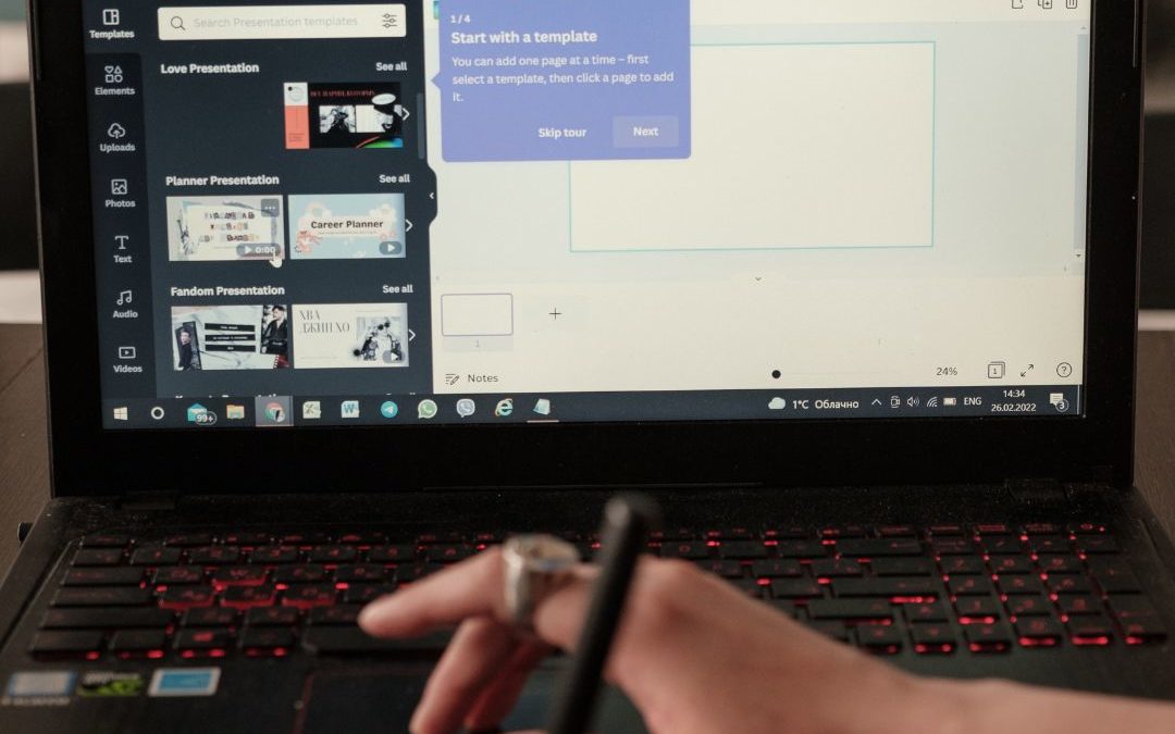
If you have no experience in graphic design and don’t have one of these experts on your team, you may find yourself trying to create your banner on your own. It can be difficult, but there are experts out there who can help you. Here at TNT Signs, our team includes graphics experts who are more than willing to help you design your banner. We have templates you can use, and we will help you find the right fonts, colors, and graphics to add to your banner. Once the banner is printed, we’ll even install it for you if needed.
We consider every custom banner we print an investment. That’s why we use high-quality vinyl that will withstand heavy winds, rain, and other severe weather. Our inks will remain bright and vivid for years, even when out in the bright sunlight for hours every day. You can have our banners hanging for years or reuse them for annual events. Even if you do need a banner with specific dates that you won’t be able to reuse, it will still be the same quality.
Contact TNT Signs Today
Whether you’ve already got your custom banner designed and need a printer or have an idea you’re not quite sure how to translate into reality, TNT Signs is here for you. Contact us today to discuss how we can help you with custom banners, signs, car wraps, and other printed materials.


