Custom signs can help bring in new customers, direct your current customers to sales or specific areas of the store, and help improve your profits. However, since you’re the one designing your custom sign, you do need to make sure it looks good and is easy to read. A poorly designed custom sign can actually turn off customers, resulting in a loss of sales. If you’ve never designed your own sign before, here are five tips that can help you create a sign that stands out and does its job.
#1 – Take the Time to Plan Out Your Custom Signs
Some people jump right in and start designing their signs, but that can backfire. Instead, take some time to think about what your signs need to do. What’s their purpose? Is this sign going to be outside or on the front windows of your store? If so, its purpose may be to get people in the doors. If it’s inside, though, it may be aimed at directing customers or providing information. Knowing the purpose of a sign will help you determine what information you need on it. External signs may need to include your website, your hours, or your phone number. Interior signs, though, likely don’t need this information.
Also, take some time to determine what colors you want to use. If you’re designing one sign, it may not be as important to figure out your graphic choices, but if you plan on having multiple signs, you may want them to look uniform. For example, you may want to include your business logo on every sign or make use of a specific font. Planning out what your signs should say and what elements should be present will help you create a clear visual that includes everything it needs to.
#2 – Make Sure Your Signs Are Readable
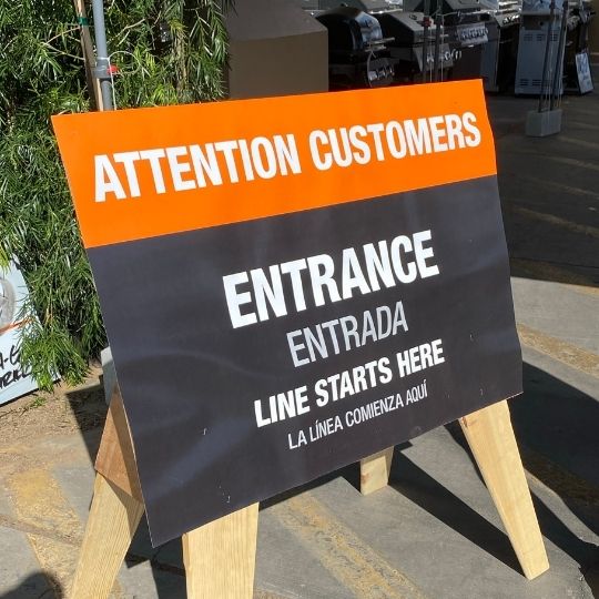
When planning out your sign, one thing you want to consider is what colors you’ll be using. You will want to be sure that your font color stands out from the background and that your company logo colors work with the rest of the sign. For example, if you have a dark blue background, you may not want to use black text since it won’t stand out. Instead, try white or yellow. If your logo is red, you may not want to use any shade of red for the background.
Think about the number of colors you’re using, too. Any more than two or three can make the sign look a little overwhelming, especially if they are three very different colors. Think about what colors go well together, what works with your branding, and what will look good in and around your store. Think about your industry, too. If you sell children’s products, go with bright primary colors and fun fonts. If you’re an upscale men’s clothing boutique, though, you may want something that looks more formal.
Fonts Matter, too
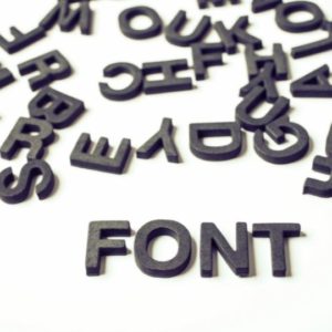
Font choice is important, too. The lettering fonts you use can say a lot about your business. If you use something like Comic Sans, for example, people aren’t likely to take you very seriously. Some fonts are heavily overused and have a reputation as such. Other fonts may be difficult to read. A curly script may look great on formal invitations, but it doesn’t work for signs directing customers to different sections of your store. Always look for a font that is clear, clean, and will stand out. Don’t be afraid to use a standard, simple font if your goal is to convey direction or provide information. You don’t necessarily need something fancy, especially if it’s a fancy font that isn’t readable at a distance or doesn’t have distinct letters.
Remember to Leave Space for the Bleed
Finally, when thinking about readability, remember to include a bleed. This is an extra eighth of an inch all the way around your design. The bleed should include the background color, so there’s no odd white space at the edges, but don’t put any text or graphics that close to the edge. If you do, you run the risk of having them cut off.
#3 – Think About Size
Custom signs and banners can be almost any size. It’s possible to have banners printed that take up the entire side of a building. However, you likely won’t need a sign that large. When you think about size, one thing to keep in mind is that standard sign sizes are going to be more affordable to print. For example, many signs are done in multiples of 12, and they may be 24 inches tall by 36 or 48 inches wide. Custom signs can be done in any size, but it may affect your cost.
Another reason why certain sizes are typical for signs is that they give you a good amount of space. A 24 x 36 sign gives you a good amount of room to include everything you need and makes the text and images large enough to be seen from a good distance away. There are many templates out there for standard sign sizes, so you may want to make use of one of them if you’ve never designed a sign before.
That said, don’t be afraid to consider a custom size if you need it. If you’ve got an odd-shaped spot on your wall that you want to fill with a sign, don’t talk yourself out of it just because it doesn’t fit a basic sign. You might be surprised at how affordable unique-sized signs are.
#4 – Understand Image Resolution
When using images on signs, it’s important that you understand resolution and how that will affect the final image. If you have a low-resolution picture and want to use it on a large banner, you may be disappointed in the final result. The image may not look that good when printed on a large sign.
When taking photos of products/people or designing logos and other graphics, think about the different sign sizes you may use these elements on. If there’s any chance you’ll want to print the photos or graphics on a large sign; you’ll want to create them in high resolution. This is usually very easy to do by changing the settings on your camera or in your graphics program. The only downside is that the file size of these images will be much larger, so you may not be able to share them as easily.
If you have a low-resolution image, you may either have to make it smaller on the sign or not use it. With graphics, you may be able to scale them up without too much pixelation, but it will depend on the graphic. It’s much easier to shrink a photo or graphic down than it is to enlarge one, so always create high-resolution, large images whenever possible. If you’re using stock photos or clip art, always look for the largest resolution option.
#5 – Know When to Change Things Up
Custom business signs are a great investment that can last for years, especially interior signs that aren’t exposed to the elements. However, while you may want to use some of these signs for years, don’t be afraid to change things up every now and then. There are a few different times you might want to switch up your signage.
You may want to create custom signs for specific holidays. For example, many retailers put up holiday signs in December that feature Santa, snowmen, and other holiday imagery. These signs help add a festive atmosphere to their store and remind shoppers that they have a limited time to purchase their holiday gifts.
Some stores do seasonal signs. They may use signs with flowers and trees on them during the spring, then swap those signs out for those with bright, sunny images for the summer. When fall rolls around, they put up signs with autumn leaves. This helps keep your signage from getting stale, plus it can extend the lifespan of your signs since you’re only using them for three or four months out of the year.
Rebranding, of course, is a good time to update your custom signs. You’ll want to swap out any signs that have your old business name, logo, color scheme, website, and other information. You may also want to create custom signs for annual sales or events. One-time signs for events such as a grand opening, re-opening, or introducing a new product can also be helpful, even if you know you’ll only use those signs once.
The Psychology of Colors in Custom Signage
Color psychology plays a crucial role in how customers perceive and react to your custom signs. Different colors evoke different emotions, influencing purchasing decisions and brand perception. For instance, red creates a sense of urgency, making it ideal for clearance sales and promotions. Blue instills trust and professionalism, often used in corporate settings. Green signifies sustainability and wellness, which is perfect for eco-friendly brands. Understanding color psychology allows you to craft signs that align with your brand message and drive customer engagement.
Optimizing Custom Signs for Digital and Physical Integration
In 2025, businesses must consider how their physical signs integrate with their digital presence. Adding QR codes to your custom signs can seamlessly connect customers to your website, special offers, or social media pages. This strategy not only enhances engagement but also provides measurable insights into customer interactions. Additionally, using augmented reality (AR) elements on signs can create an interactive experience, allowing customers to visualize products or access exclusive digital content. Leveraging technology in signage design enhances user experience and keeps your business ahead of the competition.
Sustainable and Eco-Friendly Signage Materials
Sustainability is a major consideration for businesses looking to reduce their environmental footprint. Choosing eco-friendly materials such as recycled aluminum, bamboo, or biodegradable plastics for your custom signs can appeal to environmentally conscious consumers. LED lighting options for illuminated signs also consume less energy, cutting down on operational costs while reducing your carbon footprint. By incorporating sustainable practices into your signage strategy, you not only contribute to a greener planet but also attract eco-conscious customers who prioritize sustainability in their purchasing decisions.
Need New Custom Signs? We Can Help
Designing your own custom signs may take a little work but getting them printed is incredibly easy. Just reach out to TNT Signs. Our team has years of experience in creating custom signs, banners, stickers, and even car wraps. We will work closely with you to make certain that the final products match exactly what you had in mind. We’ve worked with many businesses across a wide variety of industries, and we’re ready to put that experience to work for you.
Whether you want a banner that will stand up to heavy winds and rain or some gorgeous signage to hang inside your store, we’re here for you. Contact TNT Signs today to discuss how we can help you with all of your custom signage needs.


