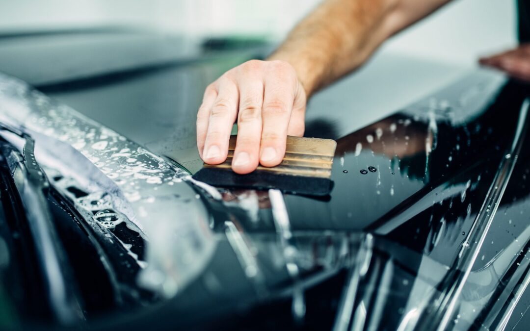
Vehicle wraps transform ordinary cars, vans, and trucks into powerful mobile advertisements. When done right, a well-designed wrap captures attention, communicates your brand message instantly, and drives customer engagement, whether you’re parked or cruising through busy streets. But not all wraps are created equal. To maximize impact, it’s essential to focus on three core design principles: layout, messaging, and visual hierarchy. In this blog, we’ll explore each element in depth, sharing best practices and real-world insights to help you create a wrap that not only looks great but performs brilliantly as a marketing tool.
Why Effective Design Matters
Imagine you have just two seconds to grab someone’s attention as they pass by your vehicle. In that brief moment, your wrap needs to:
- Stop the Scroll of Life: Stand out amid the visual clutter of the road.
- Convey Key Information: Let viewers understand who you are, what you do, and how to reach you.
- Reinforce Brand Identity: Build trust through a professional, cohesive look.
Nailing layout, messaging, and visual hierarchy ensures your wrap does more than look pretty, it drives real results, whether that’s phone calls, website visits, or walk-in traffic.

Mastering layout: Placing elements for maximum visibility
Layout is the organizational blueprint of your wrap. It dictates where logos, taglines, contact information, and graphics sit on the vehicle’s surfaces, doors, hood, rear, roof, and windows.
1. Consider vehicle “Real estate”
-
- Side panels: The largest canvases, perfect for your main logo, business name, and primary graphic. These areas get the most visibility from other drivers and pedestrians.
- Rear surface: Often the most viewed when drivers stop at red lights. Ideal for key calls-to-action, phone numbers, website URLs, and QR codes.
- Hood & roof: Premium real estate when vehicles are parked (e.g., at events, outside businesses) or viewed from overpasses. Great for promotional graphics or repeating your logo.
- Windows: Permissible with perforated film; use for taglines, operating hours, or social media handles, without blocking driver visibility.
2. Balance Coverage and Contrast
-
- Avoid overwrapping: Full coverage can look sleek, but too much competing color and pattern can overwhelm. Use large background fields of brand colors to anchor your design.
- Edge-to-edge vs. Panel cuts: Consider wrapping every panel for cohesion, or wrap only select panels (doors, hood) for a partial wrap that’s budget-friendly and still eye-catching.
- Contrast with vehicle color: If your wrap design uses light tones, ensure they sharply contrast the native paint color at any exposed edges.
3. Plan for Real-World Conditions
- Curves and contours: Use 3D digital mockups to see how graphics bend around wheel wells, door handles, and seams. Keep critical information away from deep curves.
- Seams and gaps: Align text and graphics so they don’t fall over door gaps or bumpers; this preserves readability and prevents distortion.
- Reflection zones: Metallic surfaces (chrome trim, glass) can reflect light, anticipate glare by avoiding placing small text in these areas.
Crafting Clear, Compelling Messaging
Effective wraps speak in headlines and visuals, not paragraphs. Your messaging must be concise, relevant, and action-oriented.
1. The three-word rule
Aim for three core elements:
-
- Who you are: Your business name or logo.
- What you do: A concise descriptor (e.g., “Tree Care Experts,” “Luxury Plumbing,” “On-Demand Tutoring”).
- How to reach you: Phone number or website URL (not both unless your design accommodates it clearly).
Add a call-to-action, the “plus one”, such as “Call Today,” “Book Online,” or “Visit Us” to prompt immediate engagement.
2. Taglines and Value Propositions
If space allows, a brief tagline can differentiate your brand:
-
- “24/7 Emergency services”
- “Locally owned since 1992”
- “Eco-friendly solutions”
Keep taglines under six words to maintain legibility at speed.
3. Leveraging visual icons
Icons or simple graphics (a wrench for plumbing, a leaf for landscaping) can communicate offerings faster than text. Ensure icons are:
- Universal: Easily understood across demographics.
- Simple: Bold lines and minimal detail maintain clarity at distance.
- Branded: Match your icon style to your overall brand aesthetic.

Establishing visual hierarchy: Guiding the viewer’s eye
Visual hierarchy ensures your most important information stands out first. It’s about size, contrast, and placement.
1. Size: Big for key information
- Primary element (Logo/Name): Largest text, typically 2–3 inches tall per foot of viewing distance. For roadside readability at 30 mph, letters should be at least 4–6 inches tall.
- Secondary element (Descriptor): Medium size; half to two-thirds the height of your logo text.
- Tertiary element (Contact info): Smallest on the wrap, but still large enough to be legible, a minimum of 2–3 inches tall.
2. Contrast and Color
-
- High contrast: Black text on white, white text on dark colors, or complementary color pairs (blue/orange, red/green) ensure readability.
- Accent colors: Use a vibrant accent to highlight CTAs or phone numbers, drawing the eye immediately.
- Avoid clashes: Stick to two or three brand colors; too many hues dilute your message and confuse viewers.
3. Placement and Flow
- Z-Pattern layout: Eyes naturally move in a “Z” across horizontal surfaces. Place your logo top left, descriptor in the center, and contact info bottom right for intuitive scanning.
- Golden triangle: In dynamic curves or wraps, imagine a triangle guiding the eye, logo at one point, key graphic at the second, CTA at the third.
- Whitespace: Don’t cram elements together. Strategic blank space around logos or text helps them stand out like individual “billboards” on your vehicle.
Real-world examples: Signs that work
To illustrate these principles, let’s examine a few real-world vehicle wrap examples:
Example 1: “Precision plumbing” full wrap
-
- Layout: Full coverage with bold, diagonal waves in brand blue; logo occupies the upper side panel.
- Messaging: Logo/name at 8” tall, “Emergency Repairs” tagline in 4” text, phone number in 6” red for contrast.
- Hierarchy: Logo draws attention first, description second, CTA third.
- Outcome: Local phone inquiries rose 45% in the first month.
Example 2: “GreenLeaf landscaping” Partial door wrap
- Layout: Door panels feature large leaf icon and company name; rest of vehicle remains white.
- Messaging: “Eco-friendly landscaping” tagline in green, website URL in bold black on rear quarter panel.
- Hierarchy: Icon first, name second, URL third, boarded vertically for slow-traffic areas.
- Outcome: Repeat impressions among neighborhood commuters increased residential leads by 30%.
Best practices and pitfalls to avoid
Do’s
- Test Mockups: Review full-scale print mockups or place temporary vinyl decals to gauge readability.
- Protect your investment: Use high-quality laminates to guard against UV fade, scratches, and graffiti.
- Coordinate your fleet: If wrapping multiple vehicles, ensure identical placement and design consistency.
Don’ts
- Overload with info: Avoid listing every service; focus on your core offerings to maintain legibility.
- Skimp on contrast: Never sacrifice readability for aesthetics, your wrap must be readable at a glance.
Neglect maintenance: Wash gently with pH-neutral soap and avoid high-pressure washers to prevent edge lifting.
Conclusion
An effective vehicle wrap is the perfect marriage of layout, messaging, and visual hierarchy. By thoughtfully organizing your design elements, crafting concise and compelling copy, and guiding the viewer’s eye through size and contrast, you create a wrap that not only looks stunning but also drives real business results.
Ready to transform your vehicle into a high-impact mobile billboard? TNT Signs and Graphics specializes in custom vehicle wraps designed for maximum visibility and brand engagement. Visit www.tntsignsandgraphics.com or call (707) 555-1234 to schedule your free design consultation today. Let us help you create a wrap that stops traffic, and starts conversations!