One of the first steps in creating marketing materials and other items for your business is to design a logo. While the actual design and elements of a logo are very important, the colors you use are just as vital. Will you use one color for the entire logo, or will you have several? Even if you use just one color, will you have a secondary color for your branding? For example, if your logo is navy blue, will you add another pop of color to make it stand out? Determining your color scheme before you start designing signs, banners, stickers, and other items is important to creating a cohesive brand.
Even after you have decided on your business’s main colors, your marketing pieces may have their own color scheme. For example, if you’re marketing a specific product, you may want to use that product’s colors alongside yours. You might want to bring in holiday colors during the winter, or you may want brighter, lighter colors in summer. Understanding color combinations is the first step toward creating amazing signs and other items. Once you’ve nailed the design, TNT Signs will be here to handle all of your printing needs.
The Color Wheel
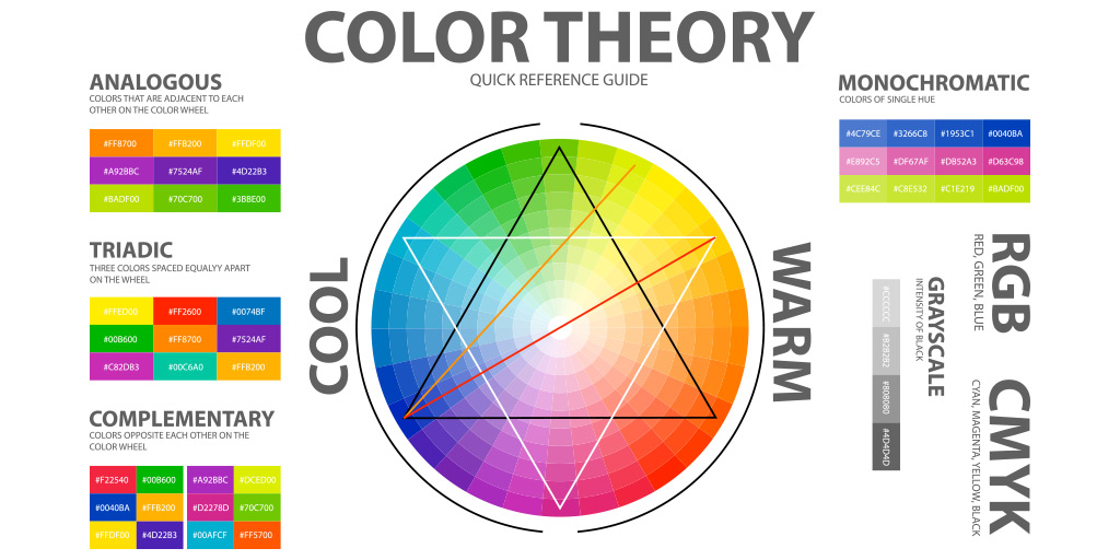
The foundation of color combinations is the color wheel. This circle places the three primary colors—yellow, red, and blue—at equidistant points around the circle. You can draw a triangle between the three of them. These three colors can’t be created by mixing other colors. The secondary colors—green, orange, and purple—can be. Green is created by mixing yellow and blue, for example, while orange is yellow and red. You can continue mixing primary and secondary colors in different combinations to get millions of other colors, all slightly different.
There are two colors that are outside of the color wheel: white and black. Black is often considered the mixture of the entire wheel, while white is the absence of all colors. You can mix white and black into primary and secondary colors as well. For example, pink is made of a mixture of red and white.
Complementary colors
Once you have a color wheel in front of you, you can see the complementary colors. These colors are opposite each other on the wheel. Orange and blue are complementary colors. They can pair very nicely, depending on the shades you use. Typically, one of these colors is used more as an accent. Blue font outlined in orange, for example, stands out. Yellow and purple are other good examples of complementary colors.
The biggest advantage of using two complementary colors on your stickers and other items is that they make each other stand out. By combining a warm color like red with a cooler color like green, both stand out nicely. When you put complementary colors next to each other, both look brighter and better.
Note that this doesn’t mean you can’t use colors that are closer together on the wheel. Red and orange can look very good together, but because these colors look more similar than complementary colors, they’re not going to jump off the page as much. In fact, you may find that while they look very distinct on their own when you put these colors beside each other, they may seem to blend together.
Knowing when to use complementary colors and when to use colors closer together is all part of color theory, the basic rules behind pairing colors and creating amazing color schemes. While you don’t necessarily have to memorize everything about color theory to make amazing signs, you do need to understand its basics.
Transforming Colors
When looking into colors and color theory, you’ll come across four different terms related to how bright a color is:
- Hue – this is the pure form of color and is what you typically see on a color wheel. It hasn’t been diluted or mixed with anything.
- Tint – this is what you get when you mix a color with white. Spring green, for example, is a lighter green that you get from mixing pure green and some white.
- Tone – the tone is a duller color. You can create tones of color by mixing it with gray. While they’re duller, they’re not “worse” colors. There’s no bad color, only bad color combinations!
- Shade – the shade is created by mixing a hue with black. Navy, for example, is a shade of blue that’s made by mixing a small amount of blue into black.
You don’t necessarily need to know which colors are shades and which are tones to use them effectively, but this can help if you’re reading up on color theory and come across these terms. What’s important is that you know how to combine hues, tints, tones, and shades into amazing color schemes.
What Are Color Schemes?
Now that we’ve talked about colors, it’s time to look at combining them. Color schemes are the combination of two or more colors. Some schemes are traditional and have a timeless look to them, while others are more modern. Some color schemes have come and gone as trends, which can actually still be helpful in some cases. For example, if you have a diner that has a retro theme, using a color scheme straight out of the 70s may be perfect. If you’re running a law firm, you’ll likely want to avoid such a dated look.
Here are some of the most popular color schemes.
Achromatic schemes
Let’s start with a color scheme that actually uses nothing from the color wheel. An achromatic color scheme features white, black, and the grays you can make by mixing them together. It can be very striking if you mainly use black and white, but it can look very sophisticated when you mix in some grays. The contrast between black and white can make very dramatic logos and images while adding grays can give you highlights and shadows that add dimension.
Complementary schemes
As discussed above, complementary color schemes use colors that are opposite each other on the color wheel. In art, this is often done to make the subject of a painting pop. For example, a painting of an orange tabby would really stand out on an orange background. If there’s an element of your design that you want to really pop, use a complementary color as the background.
Split-complement schemes
Want to use more than two colors? A split-complementary scheme can serve you well here. To create a split-complementary color scheme, take a color’s direct complement and then go to either side of it. For example, if you want to use yellow, its complementary color is purple. The split-complement colors would be in the blue-purple and red-purple color groups. The yellow will pop, while the other two colors will work well together without distracting from the yellow.
Double-complement scheme
In a double-complement design, you have two sets of complements. This gives you four main colors to work with. If blue and green are your first pair, then their complements of red and orange will be the second pair. While you have more colors here, you do have to be careful that you balance them correctly. You may decide to use one pair as pops of color while the other pair serves more as the background, or you may want to only have one color be prominent and the other three serve as accents.
Monochrome schemes
A monochrome scheme takes one color and combines it with various tints, tones, and shades of that color. For example, a monochrome blue scheme might use royal blue, navy blue, sky blue, and baby blue. This type of scheme can look incredible when used correctly. Using the darker shade in the center and adding in the other options until you have the lightest on the outer edges is one great way to use a monochrome scheme, though it’s not the only option.
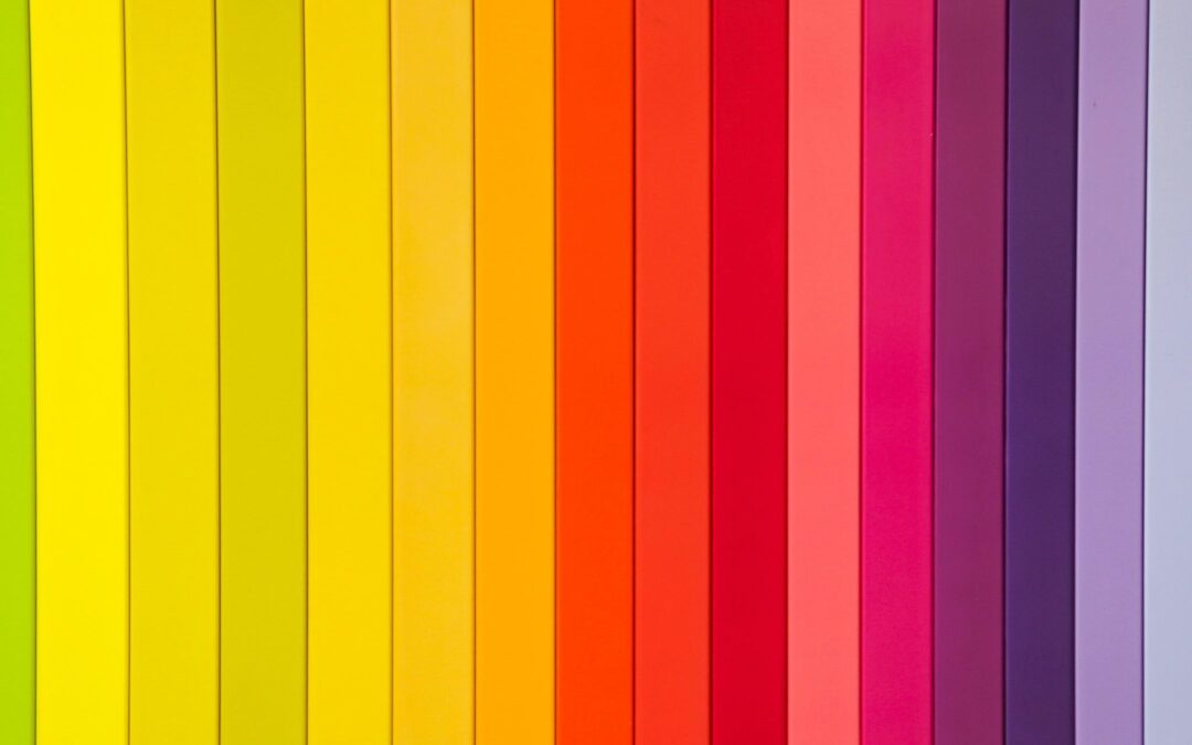
Analogous schemes
An analogous color scheme uses several colors that are next to each other. Yellow, yellow-orange, orange and a red-orange analog scheme works nicely for a gorgeous sunrise, while a beautiful night sky might contain blues, blue-greens, and greens. There’s less contrast in these schemes, but the colors can blend into each other nicely.
Which Color Combination is Right for You?
Determining which color combination is right for your sign, banner, vehicle wrap, or other item depends on what you’re trying to convey to your business. For many basic signs, simply using black text on a white background is often enough. An “open” sign, for example, doesn’t need a complex color scheme. You might want to put your logo on it, but that’s about the only additional decoration it needs other than text.
On the other hand, if you’re designing a vehicle wrap for your company delivery truck, you’ll want to consider various color options. You may want to use a photograph and then bring in some complementary colors based on the most prevalent color in the picture. If you’re in need of help determining what colors to use, the design team at TNT Signs can help. Reach out today to discuss your next print project.