Hello from TNT Signs! Signage design is an essential aspect of effective communication and branding. Two crucial elements that significantly influence the effectiveness of signage are color and typography. These design components not only attract attention but also shape customer perceptions and behavior. In this blog, we will explore the psychology of color and typography in signage design, and how businesses can leverage these elements to create compelling and impactful signs.
The Psychology of Color in Signage Design
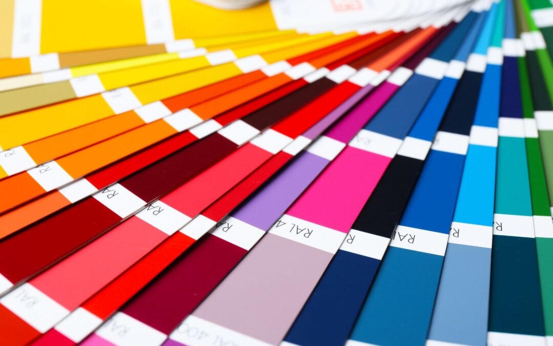
Color is a powerful tool in signage design, as it can evoke emotions, convey messages, and influence perceptions. Understanding the psychology of color can help businesses choose the right colors for their signs to achieve the desired impact.
1. Red: Energy and Urgency
- Emotions: Red is associated with excitement, passion, and urgency. It can increase heart rates and create a sense of urgency.
- Applications: Use red to grab attention, highlight sales or promotions, and create a sense of urgency.
- Example: A retail store uses red banners to announce a limited-time sale, attracting customers with a sense of urgency.
2. Blue: Trust and Calm
- Emotions: Blue evokes feelings of trust, calmness, and professionalism. It is often associated with reliability and stability.
- Applications: Use blue for corporate signage, healthcare facilities, and financial institutions to convey trust and reliability.
- Example: A bank uses blue signage to create a professional and trustworthy image, reassuring customers of their financial stability.
3. Green: Growth and Health
- Emotions: Green is linked to nature, growth, and health. It symbolizes freshness, harmony, and sustainability.
- Applications: Use green for eco-friendly businesses, health-related services, and food industries to convey health and sustainability.
- Example: An organic grocery store uses green signs to emphasize their commitment to natural and healthy products.
4. Yellow: Optimism and Attention
- Emotions: Yellow represents optimism, cheerfulness, and attention. It is a bright and energetic color that can grab attention quickly.
- Applications: Use yellow to highlight important information, create a cheerful atmosphere, and draw attention.
- Example: A tech store uses yellow signs to highlight new arrivals and special offers, capturing customer attention.
5. Orange: Enthusiasm and Creativity
- Emotions: Orange combines the energy of red and the cheerfulness of yellow. It is associated with enthusiasm, creativity, and excitement.
- Applications: Use orange for creative industries, promotions, and events to evoke excitement and creativity.
- Example: A sportswear brand uses orange signage to promote a new line of athletic gear, creating a sense of enthusiasm and energy.
6. Purple: Luxury and Creativity
- Emotions: Purple is linked to luxury, creativity, and sophistication. It is often associated with royalty and high quality.
- Applications: Use purple for luxury brands, creative businesses, and high-end products to convey sophistication and creativity.
- Example: A high-end spa uses purple signs to promote their premium services, creating an aura of luxury and exclusivity.
7. Black: Elegance and Authority
- Emotions: Black signifies elegance, authority, and sophistication. It can create a sense of power and exclusivity.
- Applications: Use black for luxury brands, fashion, and corporate signage to convey elegance and authority.
- Example: A luxury watch brand uses black signs to highlight their premium products, emphasizing exclusivity and elegance.
8. White: Simplicity and Cleanliness
- Emotions: White represents simplicity, cleanliness, and purity. It can create a sense of space and clarity.
- Applications: Use white for minimalist designs, healthcare, and technology to convey cleanliness and simplicity.
- Example: A tech company uses white signage to create a sleek and modern look, emphasizing simplicity and innovation.

The Psychology of Typography in Signage Design
Typography, the art of arranging type, plays a crucial role in signage design. The choice of font, size, and spacing can significantly impact readability, aesthetics, and the overall effectiveness of a sign.
1. Serif Fonts: Tradition and Reliability
- Characteristics: Serif fonts have small lines or extensions at the ends of letters. They are often seen as traditional and reliable.
- Applications: Use serif fonts for formal, traditional, and professional signage.
- Example: A law firm uses serif fonts on their office signs to convey reliability and professionalism.
2. Sans-Serif Fonts: Modern and Clean
- Characteristics: Sans-serif fonts lack the small lines at the ends of letters, giving them a clean and modern appearance.
- Applications: Use sans-serif fonts for modern, minimalist, and tech-related signage.
- Example: A software company uses sans-serif fonts on their office signs to create a sleek and contemporary look.
3. Script Fonts: Elegance and Creativity
- Characteristics: Script fonts mimic cursive handwriting and are often associated with elegance and creativity.
- Applications: Use script fonts for luxury brands, creative industries, and personal touches.
- Example: A boutique uses script fonts on their signage to create an elegant and personalized feel.
4. Display Fonts: Bold and Attention-Grabbing
- Characteristics: Display fonts are decorative and unique, designed to grab attention and stand out.
- Applications: Use display fonts for headlines, promotions, and unique branding.
- Example: A music festival uses bold display fonts on their posters to capture attention and convey excitement.
Combining Color and Typography for Maximum Impact
The combination of color and typography can enhance the effectiveness of signage by creating a cohesive and impactful design. Here are some tips for combining these elements:
1. Contrast and Readability:
- Ensure Readability: Use high contrast between text and background colors to ensure readability from a distance.
- Example: A restaurant uses white text on a dark green background for their outdoor menu board, ensuring the text is easily readable.
2. Consistency in Branding:
- Maintain Brand Identity: Use consistent colors and fonts that align with your brand identity to create a cohesive look.
- Example: A fashion brand consistently uses a specific shade of purple and a sleek sans-serif font across all their signage, reinforcing their brand identity.
3. Hierarchy and Emphasis:
- Guide Attention: Use different font sizes, weights, and colors to create a visual hierarchy and guide the viewer’s attention.
- Example: A retail store uses a large, bold font for sale announcements and smaller, regular fonts for additional details, guiding customers’ attention to the key message.
4. Emotion and Tone:
- Match the Message: Choose colors and fonts that match the tone and emotion of your message.
- Example: A children’s bookstore uses playful, colorful fonts and bright colors to create a fun and inviting atmosphere.
Case Studies: Effective Use of Color and Typography in Signage
1. Case Study: Tech Company Office Signage
- Objective: Create a modern and innovative look for the office signage of a tech company.
- Design Choices: The company used sans-serif fonts and a white color scheme with blue accents.
- Result: The signage conveyed a sense of innovation and professionalism, aligning with the company’s brand identity.
2. Case Study: Organic Grocery Store
- Objective: Emphasize the natural and healthy products of the store through signage.
- Design Choices: The store used green and white colors with serif fonts to create a traditional and trustworthy look.
- Result: The signage effectively communicated the store’s commitment to natural products, attracting health-conscious customers.
3. Case Study: High-End Spa
- Objective: Create a luxurious and relaxing atmosphere through signage.
- Design Choices: The spa used purple and gold colors with script fonts to convey elegance and luxury.
- Result: The signage enhanced the spa’s luxurious image, attracting clients seeking high-end services.

Conclusion
Color and typography are powerful tools in signage design, capable of shaping customer perceptions and influencing behavior. By understanding the psychology behind these elements and applying them effectively, businesses can create impactful and memorable signs that enhance their brand identity and improve customer engagement.
At TNT Signs, we specialize in designing custom signage that leverages the power of color and typography to achieve your business goals. Contact us today to learn more about our design services and how we can help you create signs that stand out and deliver results. Let’s work together to make your signage truly remarkable!