In the competitive world of mobile advertising, a vehicle wrap isn’t just a simple decoration—it’s a moving extension of your brand’s identity. A well-executed wrap can transform your fleet into a dynamic billboard that grabs attention, drives online engagement, and creates lasting impressions. In this blog, we’ll explore key design strategies: from choosing the best color combinations and leveraging contrast for readability, to seamlessly integrating social media handles and deciding between minimalist or bold aesthetics. We’ll also cover common design mistakes and how to avoid them so that your wrap truly works for your brand.
Best Color Combinations for High-Visibility Wraps
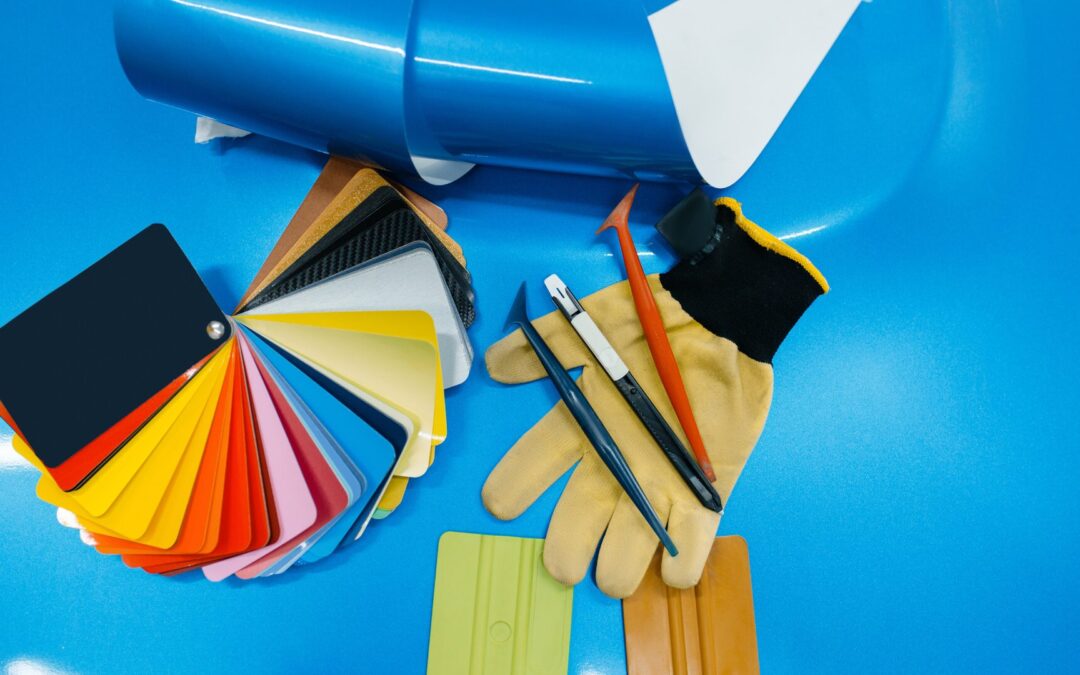
When it comes to vehicle wraps, color is your first impression. The right palette does more than just capture attention—it can make your message clear and your brand instantly recognizable.
- High-Contrast Pairings: Using complementary colors such as blue and orange or black and yellow can significantly boost visibility. High contrast not only makes your design pop but also enhances readability from a distance.
- Bold Backgrounds with Accent Colors: A bold, solid background paired with one or two accent colors can draw the eye, ensuring your key elements—like your logo or call-to-action—stand out.
- Industry Considerations: Different industries often have color associations. For example, eco-friendly brands might lean towards greens and blues, while tech companies often choose sleek blacks with bright neon accents.
How Color Contrast Improves Readability
Contrast is more than a visual trick—it’s a fundamental tool in design. When text and graphics contrast sharply with the background, they’re easier to read even at high speeds or from a distance. A high-contrast design ensures that your message isn’t lost in a blur of colors; instead, it becomes a clear, direct communication that grabs attention immediately.
Incorporating Social Media Handles in Your Wrap Design
Today’s consumers are as connected online as they are on the street. Including your social media handles in your vehicle wrap design isn’t just an add-on—it’s a way to drive digital engagement.
- Subtle Yet Visible Placement: Consider placing your social media handles on areas that naturally catch the eye, such as near the rear window or along the side panels.
- Integrative Design Elements: Use graphic elements that complement your overall design. For instance, a stylized hashtag or a QR code that links to your profiles can be both functional and aesthetically pleasing.
- Call-to-Action: Encourage interaction by inviting onlookers to “Follow Us for Exclusive Offers” or “Share Your #BrandRide.” This not only increases your digital footprint but also transforms your vehicle into an interactive marketing tool.
Using Wraps to Drive Online Engagement and Customer Interaction
Vehicle wraps can be more than just static advertisements—they can be interactive gateways to your online presence.
- QR Codes and Interactive Elements: Incorporate QR codes that lead to landing pages, special promotions, or social media contests. This seamless blend between the physical and digital worlds makes your wrap a tool for engagement.
- Social Media Hashtags: Promote a branded hashtag to encourage customers to share photos of your wrapped vehicle. This user-generated content can amplify your reach organically.
- Event-Driven Campaigns: Use your wraps during special events or product launches to drive online chatter. When your vehicle becomes a talking point, your digital channels will light up with engagement.
Minimalist vs. Bold Wrap Designs: Which Works Best for Your Brand?
Choosing between a minimalist design and a bold, eye-catching layout is a critical decision that depends on your brand identity and target audience.
Minimalist Designs
- Clean and Modern: A minimalist wrap features clean lines, simple typography, and a limited color palette. It’s perfect for brands that want to exude sophistication and clarity.
- Focus on the Essentials: With fewer elements on display, every detail counts. This design works well for industries like finance, luxury goods, or tech, where understated elegance reinforces trust and quality.
- Easy to Update: Simplicity often makes a design easier to adapt. Minimalist wraps can be updated with seasonal changes or new messaging without overwhelming the viewer.
Bold Designs
- Vibrant and Energetic: Bold designs use striking colors, dynamic graphics, and large, impactful imagery to immediately capture attention. They work well for entertainment, sports, and lifestyle brands.
- Memorable Messaging: A bold wrap leaves a strong visual impression, ensuring that your brand message is not only seen but remembered.
- Industry Considerations: Bold designs can be particularly effective for businesses looking to make a splash in crowded markets, such as fast food chains or retail outlets.
Comparing for Different Industries
- Service Industries: Often benefit from minimalist designs that project professionalism and reliability.
- Consumer-Facing Brands: Can leverage bold designs to create excitement and drive impulse engagement.
- Local Businesses: May find that a mix—clean layouts with one bold, standout element—provides the perfect balance for driving local brand recognition.
Common Vehicle Wrap Design Mistakes & How to Avoid Them
Even the most innovative design ideas can fall flat if not executed properly. Here are some common pitfalls and tips to avoid them:
Poor Font Choices
- Avoid Overly Decorative Fonts: While unique fonts can enhance personality, readability should always be your priority.
- Size Matters: Ensure that your text is large enough to be read from a distance. Test your design at various sizes to confirm legibility.
Cluttered Layouts
- Less is More: Don’t overwhelm the viewer with too many elements. A busy design can dilute your brand’s message.
- Whitespace: Use whitespace effectively to give your design room to breathe. This helps guide the viewer’s eye to your key messages.
Incorrect Color Combinations
- Test for Contrast: Ensure that your chosen colors have enough contrast to be effective. Avoid color combinations that blend into each other, especially in low-light conditions.
- Brand Consistency: Stick to your brand’s color palette to maintain a cohesive look. Straying too far can confuse your audience.
Misplacement of Key Elements
- Strategic Placement: Ensure that crucial information like your logo, social media handles, and call-to-action are placed where they’re easily seen.
- Consider the Vehicle’s Shape: A design that looks great on paper may not translate well onto a curved surface. Always preview your design on a template of your vehicle.
Conclusion
Designing an effective vehicle wrap is a blend of art and strategy. The right color combinations, smart use of contrast, and thoughtful incorporation of digital elements like social media handles can elevate your wrap from a mere advertisement to a powerful branding tool. Whether you lean towards a minimalist or bold approach, understanding the principles of design and avoiding common pitfalls will ensure your message is clear, impactful, and memorable.
At TNT Signs and Graphics, we’re committed to turning your vision into a wrap that not only stands out on the road but also drives real engagement and brand recognition. Ready to transform your vehicle into a rolling canvas that tells your brand’s story? Let’s create something amazing together.