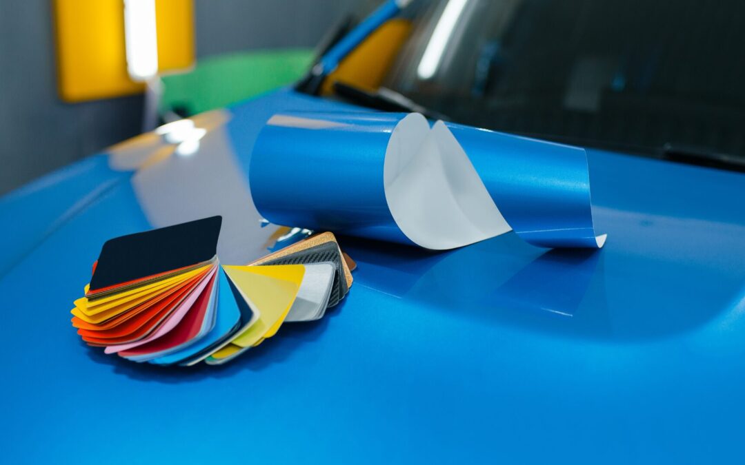
In the fast-paced world of mobile advertising, vehicle wraps have emerged as one of the most cost-effective ways to get your brand noticed. But wrapping your fleet in any random color isn’t enough—strategic color choices can make or break your campaign’s effectiveness. Welcome to the science of color psychology on wheels: how to select vehicle wrap hues that not only look eye-catching but also evoke the right emotions, reinforce your brand identity, and ultimately drive more conversions.
Why Color Psychology Matters for Vehicle Wraps
Humans process visual information 60,000 times faster than text, and color plays a pivotal role in how we interpret and remember what we see. In marketing, colors are shorthand cues for emotion and action: red signals urgency, blue builds trust, green suggests eco-friendliness, and so on. When your vehicle is wrapped in a carefully chosen palette, it does more than attract attention—it shapes perceptions of your brand before a single word is read.
A well-executed wrap can:
- Increase Brand Recall by up to 80% when colors align with your identity
- Enhance Legibility so your messaging registers in the split-second glances of passing traffic
- Evoke Desired Feelings (excitement, trust, calm) that predispose viewers to choose your business
Let’s dive into the core principles of color psychology for vehicle wraps.
Warm vs. Cool Colors: Setting the Tone
When to Use Warm Colors (Reds, Oranges, Yellows)
Warm hues grab attention instantly. They’re energetic, passionate, and memorable—ideal for businesses that want to convey excitement, urgency, or appetizing appeal.
- Red: Stimulates appetite and action; perfect for food trucks, quick-serve restaurants, and clearance-sale promos.
- Orange: Conveys friendliness and affordability; great for family-oriented services, seasonal events, and construction/utility vehicles signaling caution.
- Yellow: Evokes optimism and warmth; excellent for sunshine-themed brands, children’s products, and anything meant to feel approachable.
Use Case Example: A local pizza delivery van wrapped in a bright red and orange gradient saw a 15% bump in late-night orders because the warm colors triggered hunger cues and a sense of speed.
When to Use Cool Colors (Blues, Greens, Purples)
Cool colors communicate calm, stability, and professionalism. They’re ideal for service providers whose success hinges on trust and reliability.
- Blue: Universally associated with trust and competence; the go-to for plumbers, HVAC technicians, and financial services.
- Green: Symbolizes health, eco-friendliness, and tranquility; perfect for landscaping companies, organic grocers, and medical services.
- Purple: Connotes creativity and luxury; a strong choice for boutique retailers and creative agencies.
Use Case Example: A plumbing company that rewrapped its service vans in navy and aqua blue reported a 20% increase in customer trust ratings on post-service surveys, leading to higher referral rates.
Contrast & Readability: Ensuring Your Message Registers
Even the most vibrant colors are useless if your text and logo get lost. Contrast—and thoughtful accent hues—is crucial when vehicles cruise past at 30–60 mph.
High-Contrast Pairings
- Light Text on Dark Background: White or neon lettering on navy, black, or deep green creates maximum legibility.
- Dark Text on Light Background: Black, charcoal, or deep blue lettering on white, cream, or pastel wraps pops in bright sunlight.
Accent Hues for Calls-to-Action
Use a third, high-contrast accent color for phone numbers, URLs, or “Call Now” buttons. For example, a dark-blue wrap with white text can use a vivid orange or lime-green accent to draw the eye directly to the CTA.
Font Considerations
- Sans-Serif Fonts: Clean and simple—optimal at speed.
- Minimum Height: Letters should be at least 4–6 inches tall for roadside readability.
Spacing: Generous kerning prevents blurring when viewed from a distance.
Industry Case Examples: Color Choices That Convert
Plumbing & Home Services: Trustworthy Blues
Company: ClearFlow Plumbing
Wrap Colors: Navy base, aqua accents, white text
Results: 25% increase in service inquiries within the first quarter
Why It Worked: Blue’s association with competence reassured homeowners; aqua accents evoked clean water and efficiency.
Food Trucks & Restaurants: Mouth-Watering Warmth
Company: Taco Fiesta
Wrap Colors: Fiery red and golden yellow gradient, black text outlines
Results: 18% boost in spontaneous lunch purchases
Why It Worked: Red triggered appetite, and yellow conveyed friendliness; the gradient suggested a fiesta vibe.
Landscaping & Eco-Services: Fresh-Cut Greens
Company: GreenScape Solutions
Wrap Colors: Leafy green with white and brown accents
Results: 30% rise in quote requests
Why It Worked: Green signaled environmental stewardship; brown accents grounded the design with an earthy feel.
Cultural Nuances: Color Meanings Around the World
For multi-city or international fleets, remember that color meanings vary by region:
- Red: Good luck in China, danger in Western contexts, mourning in South Africa.
- White: Purity in Western cultures, mourning in parts of Asia.
- Green: Sacred in Islam, unlucky in some Latin American countries when used alone.
Pro Tip: For national chains, consider region-specific wrap variants. A green-heavy wrap might work great in California’s eco-market but could require an accent shift in a region where green has less positive connotations.
Actionable Tips: Testing Your Wrap Palette
1. Swatch Tests in Natural Light
- Print small vinyl swatches of each hue.
- Attach them to your vehicle panels (door, hood) and observe under various lighting—dawn, midday sun, overcast, dusk.
2. Digital Mockups & 3D Renderings
- Use templates or mockup software to preview colors on your specific vehicle make/model.
- Rotate lighting angles and backgrounds to catch edge-cases.
3. A/B Wrap Trials
- Wrap two identical vehicles (or partial panels) in different palettes.
- Run both in the same market for 60 days, tracking impressions (via GPS-based analytics), website visits to unique URLs, and new customer quotes.
4. Solicit Feedback
- Host a small focus group of existing customers and prospects.
- Present mockups and conduct quick polls: “Which color feels more professional? Which grabs your attention?”

Bringing It All Together
Choosing the right vehicle wrap colors is both art and science. By understanding warm versus cool color impacts, ensuring high contrast for legibility, studying industry best practices, accounting for cultural nuances, and rigorously testing palettes, you’ll craft wraps that do more than look sharp—they convert.
A wrap designed with color psychology in mind becomes a silent salesperson—evoking emotions, reinforcing trust, and prompting action every mile it travels.
Next Steps
Ready to wrap your fleet in a palette that captivates and converts? TNT Signs and Graphics specializes in custom, color-optimized wraps tailored to your brand and market. Contact us today for a free color consultation and mockup:
📞 (707) 555-1234
🌐 www.tntsignsandgraphics.com
Let’s put the science of color to work on your wheels—and watch your conversions accelerate!