 How will your sign design work? Creating a great sign is about more than combining a bunch of nice looking shapes and then posting them in the largest print possible. You also have to keep your sign’s color in mind. In fact, this is one of the most important factors to consider when designing a sign. Here is why color is such an important factor for sign design:
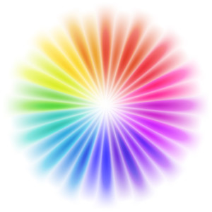
Most people don’t see in black and white
First things first, color is important for your sign design because most people can see it! Since most people can see color, you can bet your next sale that they will notice the colors in your sign design. Here is how this affects how well your sign performs for your business:
Color catches eyes
Black letters on a white background are great for typed documents and…well that’s about it. Unlike documents that a person intentionally picks up to read, your signs have to get someone who doesn’t expect to see — let alone has any intention of reading it — to look at your sign. Black and white signs simply don’t stand out against the diverse backdrop that is the real world; in fact, they often blend in with whatever is around and behind them. The reason that you are putting a sign up in the first place is to attract the attention of potential customers, so this just won’t do. Basically, you need color in your sign just to make sure that people bother to take a good look at it.
Color broadens your ability to communicate
When you put that sign up, you want it to say something. Including a captivating image or outright including words are great for this. What you can clearly say with words and pictures within that rectangular space, however, is limited. Color is an extra means of communication that you should be using. Red, for example, tells people that they should pay close attention to a certain area on your sign (even if that area is your whole entire sign); green tells people that a certain area on your sign is telling them about something practical.
Color creates feelings
This is some psychology 101 stuff here. Is it a well-known fact by psychologists that seeing a certain color or combination of colors can literally alter someone’s mood. Red, for instance, is known to create a feeling of energy and liveliness; blue, on the other hand, is known to create a calming, soothing effect. These effects are bot only altered by the color itself, but also the tone. A very light sky blue, for example, will create a different emotional effect than an intensely bold royal blue. Businesses have been using this knowledge to help them improve everything from their interior decorations to their sign design.
Color in your sign design helps people define your business
No matter how great your products and services are, how people define your business will determine whether or not they will bother to even consider buying from you. Every color-related factor discussed above contributes to how people feel about your business. If you ignore these factors in your sign design, then people could be getting the wrong idea about your business without even knowing it.
What do the colors in your sign say?
When thinking about your sign design, the colors that you choose for it are just as important as the quality of the print, its size, the graphics and photos that it includes, and the words that are written on it. Do the colors in your sign design help your business?